The Oral Health and Wellness Clinic operates as a student-centred facility supervised by experienced professionals. They offer outstanding dental, massage, and occupational/physiotherapy services, all while fostering student growth through practical experience, innovation, and community involvement in wellness. Fanshawe College's Oral Health and Wellness Clinic provides these services at discounted rates. These clinics function as real-world learning settings where students can apply their skills under expert guidance, enhancing community well-being and educational experiences.
Objective
This project had four main objectives.
Firstly, establish a unified and cohesive brand identity for the A1001 space (the clinic), which includes Dental, Massage, and Occupational Therapy areas. This branding needed to incorporate a common design element that ties together the three services offered at the clinic, create environmental branding for the entrance and lobby areas, enhance the overall atmosphere, and design elements for the walls and hallways of each respective clinic area.
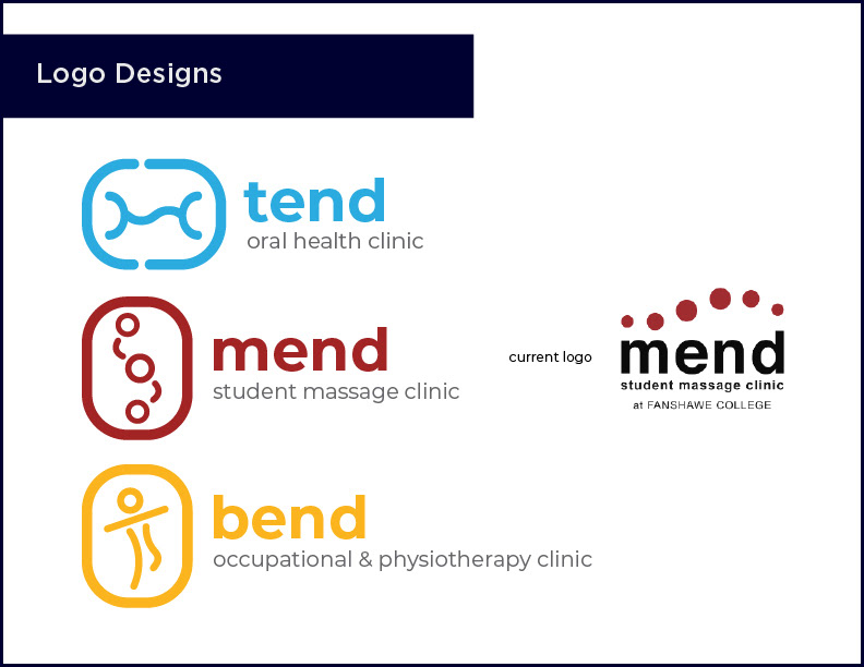
Secondly, the project involved designing logos and creating appropriate names (excluding "Mend") for the clinic's three health programs and the overall clinic, the Oral Health & Wellness Clinic. These programs include Occupational Therapist Assistant & Physiotherapist Assistant, Dental Hygiene & Assisting, and Fanshawe's Massage program, known as Mend Student Massage Therapy Clinic, which already had a logo designed in 2015. Additionally, a simplified style guide was required to outline specifications and guidelines for the client's use, ensuring consistency across the logos of the various health programs and services offered at the clinic.
Thirdly, create a campaign to promote the Health Sciences programs to prospective students interested in Occupational Therapy & Physiotherapy, Massage Therapy, and Dental programs. A brief recorded presentation was necessary for the client to review and select from 60 student designs.
To fulfill the client's requirements, the project involved creating outdoor signage for the entrance and exterior windows, as well as the main lobby doors and windows. Designing waiting areas and receptions for the three programs and creating wall designs were also essential. In addition to the other requirements, a stationary identity package and logo file guide for the clients were also needed for the Oral Health & Wellness Clinic, with the option of extending this stationary design to cover the rest of the clinic's programs. The goal was cultivating a welcoming and calming environment, fostering a sense of pride and ownership among students, faculty, and other visitors.
Finally, the project also included creating a concise 45-60-second explainer video focusing on one of the clinic programs. I chose Tend Oral Health Clinic and wanted the video to highlight the advanced features and services offered by the clinic to both students and the public.

Bend Occupational & Physiotherapy Clinic Logo
Tend Oral Health Clinic Logo
Mend Student Massage Clinic Logo

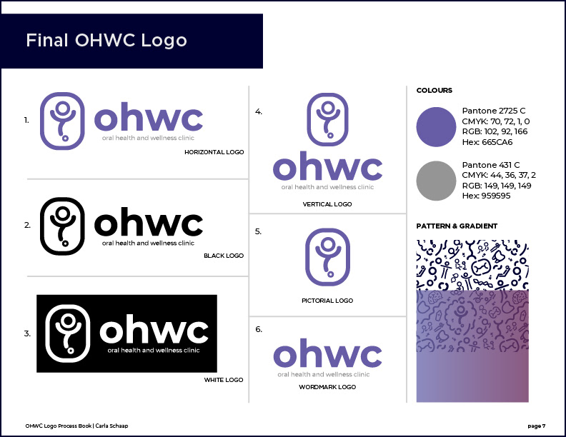
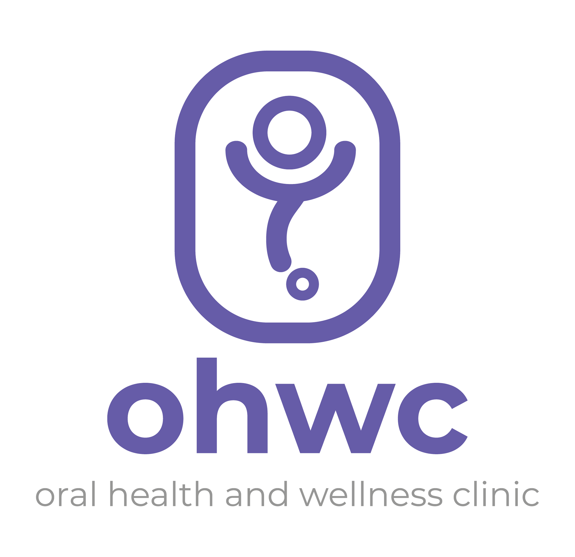
Oral Health & Wellness Clinic Logo
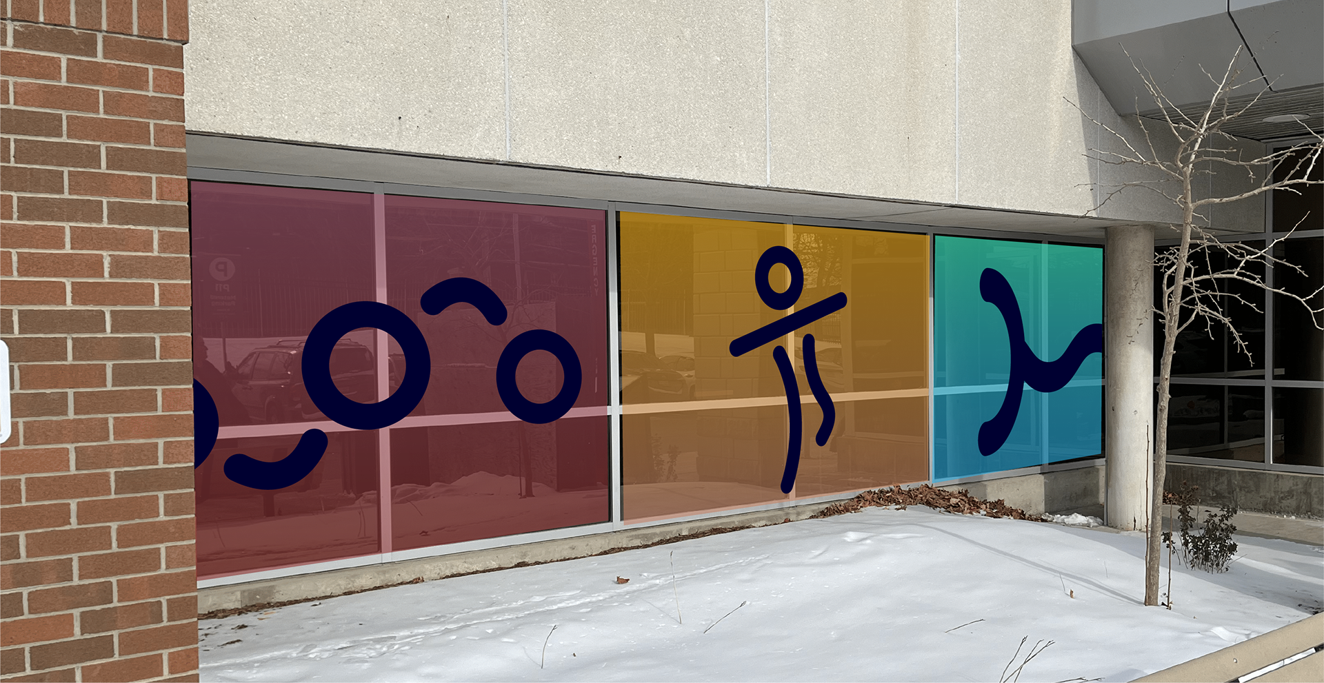
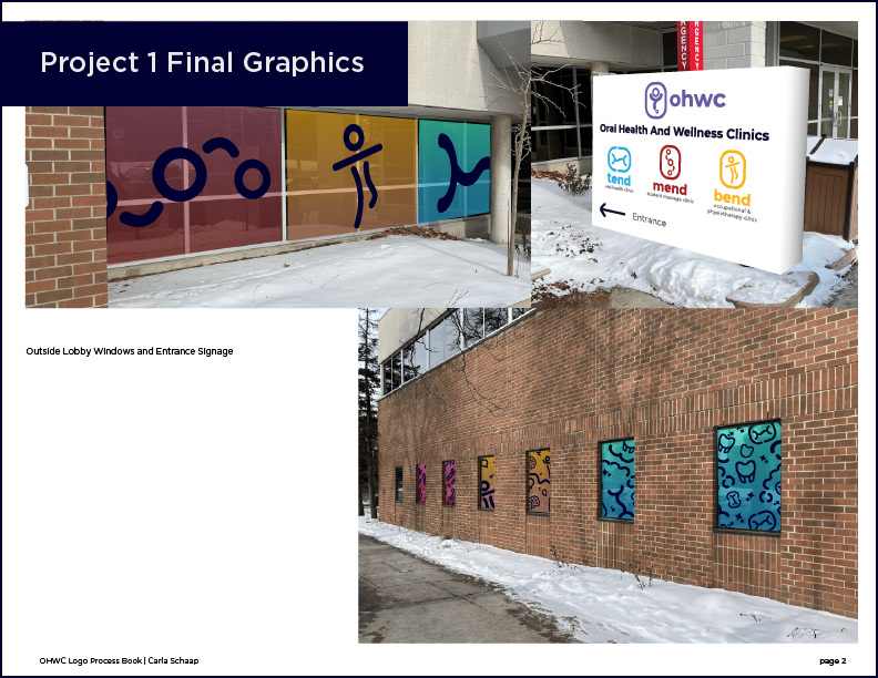
Exterior Main Looby Window Graphics
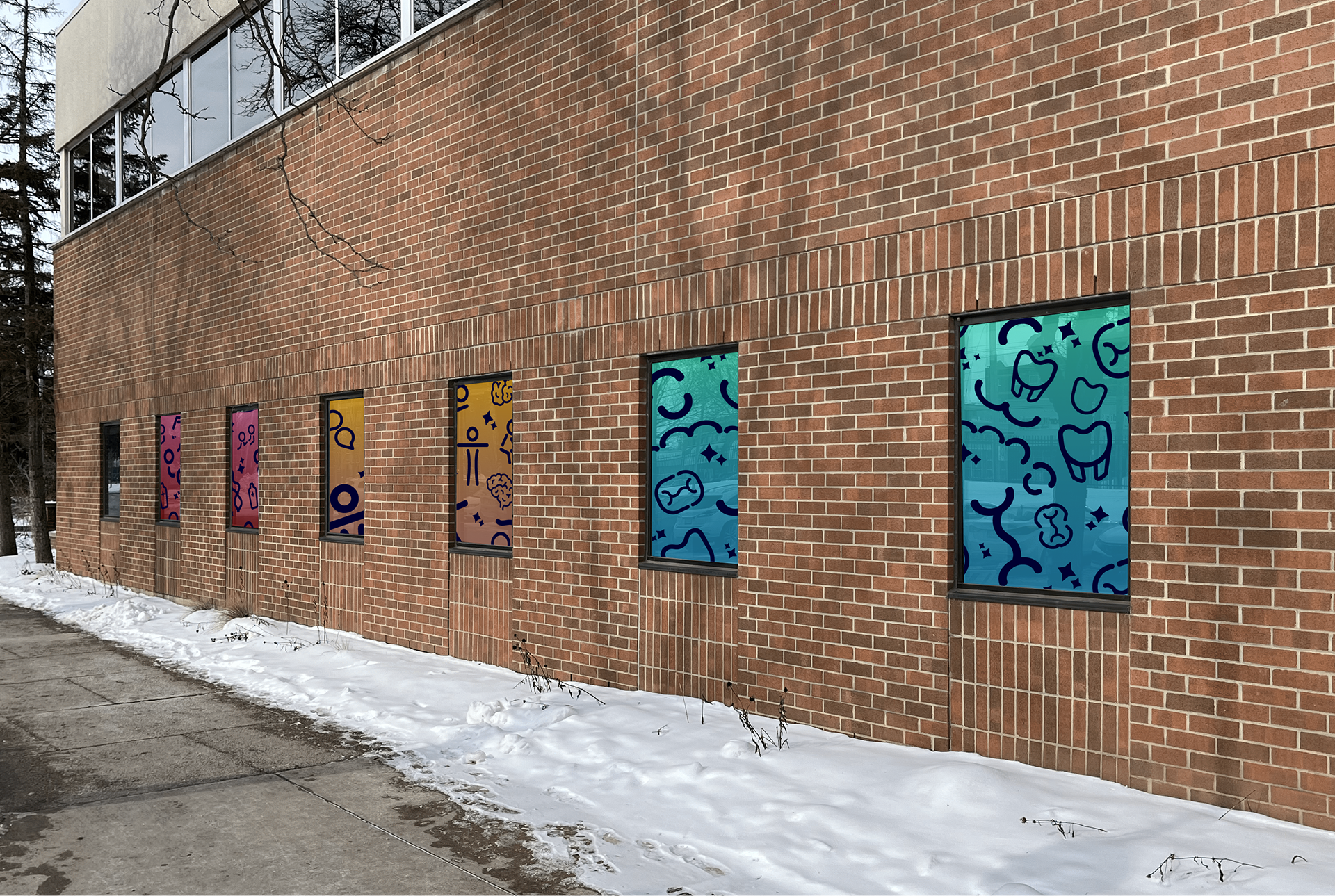
Exterior Clinic Windows
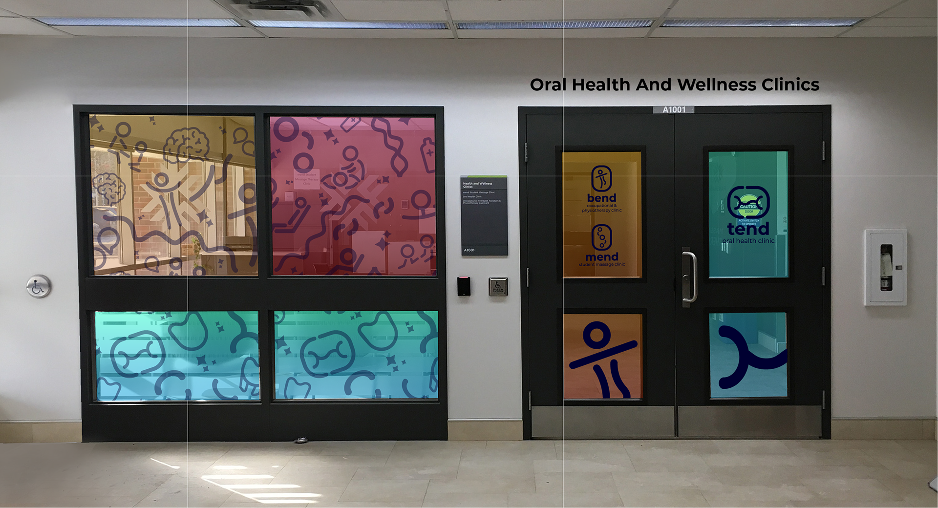
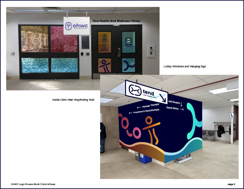
Window & Door Entrance Designs (behind this the Mend & Bend Waiting Room)
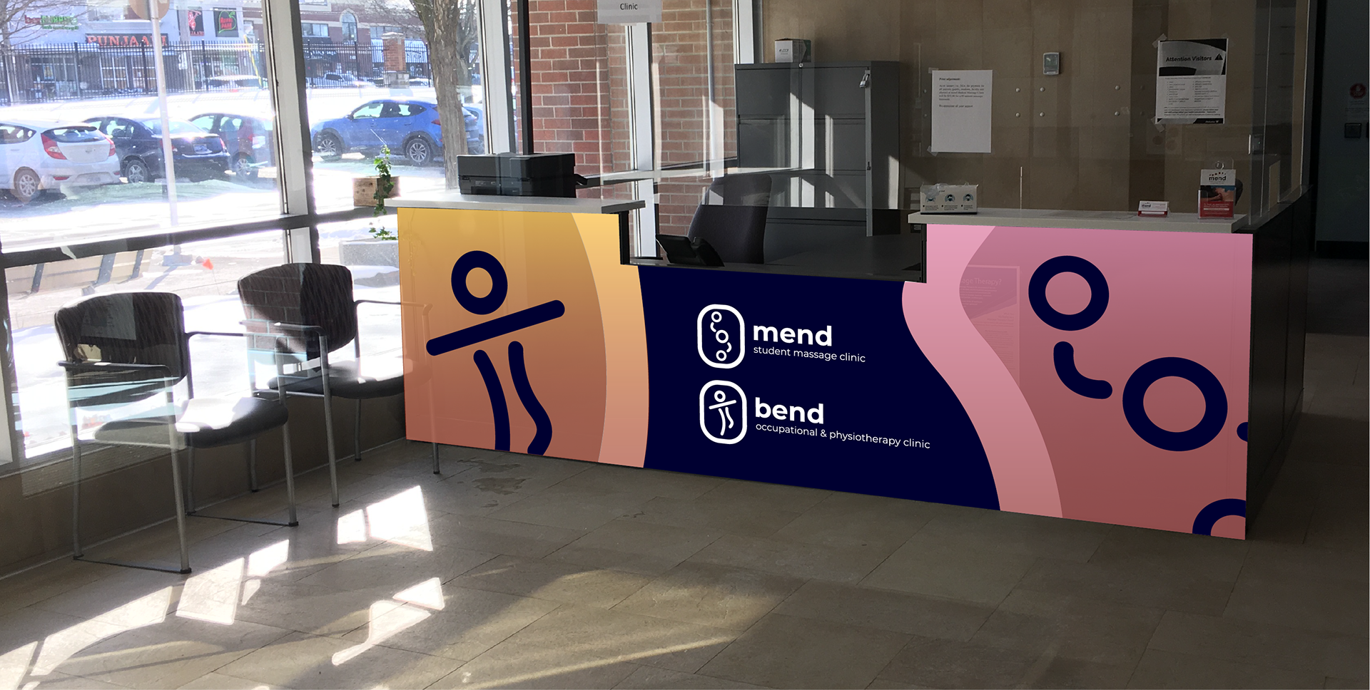
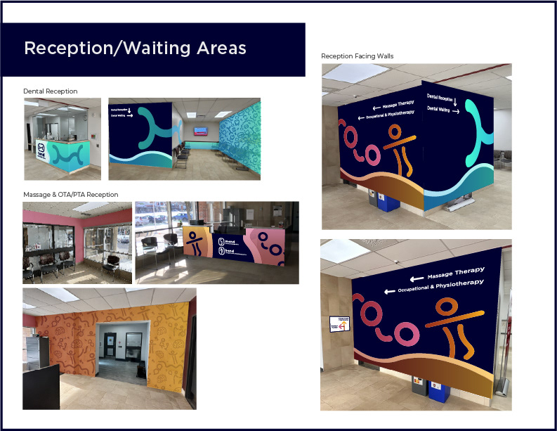
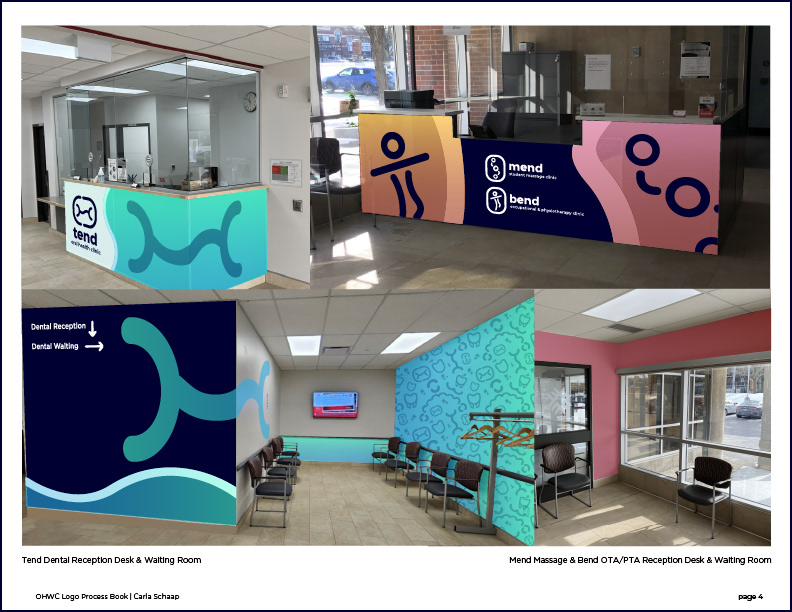
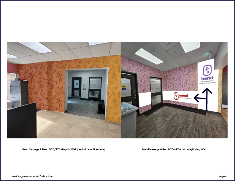
Mend Massage & Bend Occupational/Physiotherapy Reception Desk
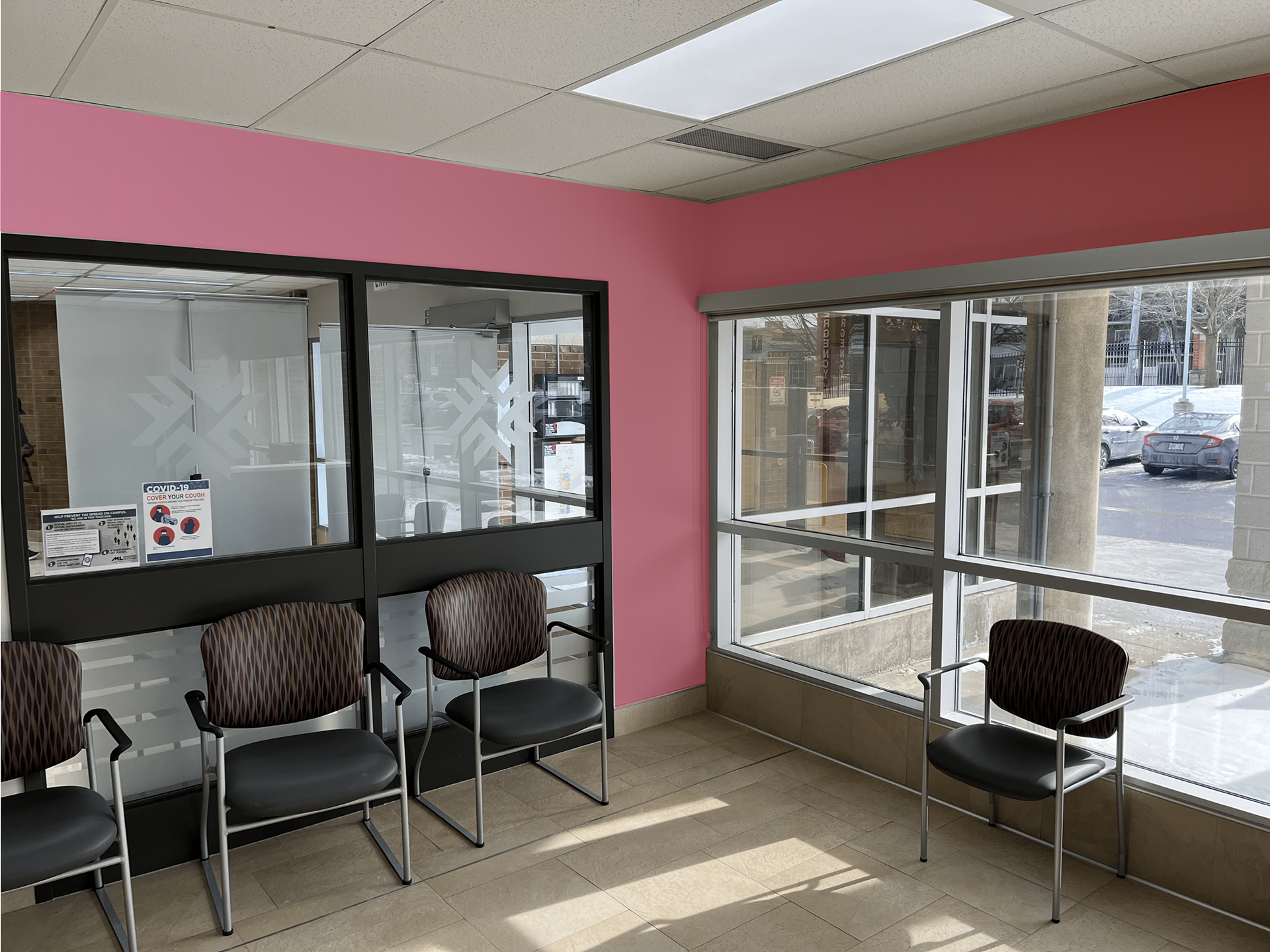
Mend Massage & Bend Occupational/Physiotherapy Waiting Room
Mend Massage & Bend Occupational/Physiotherapy Reception Wall
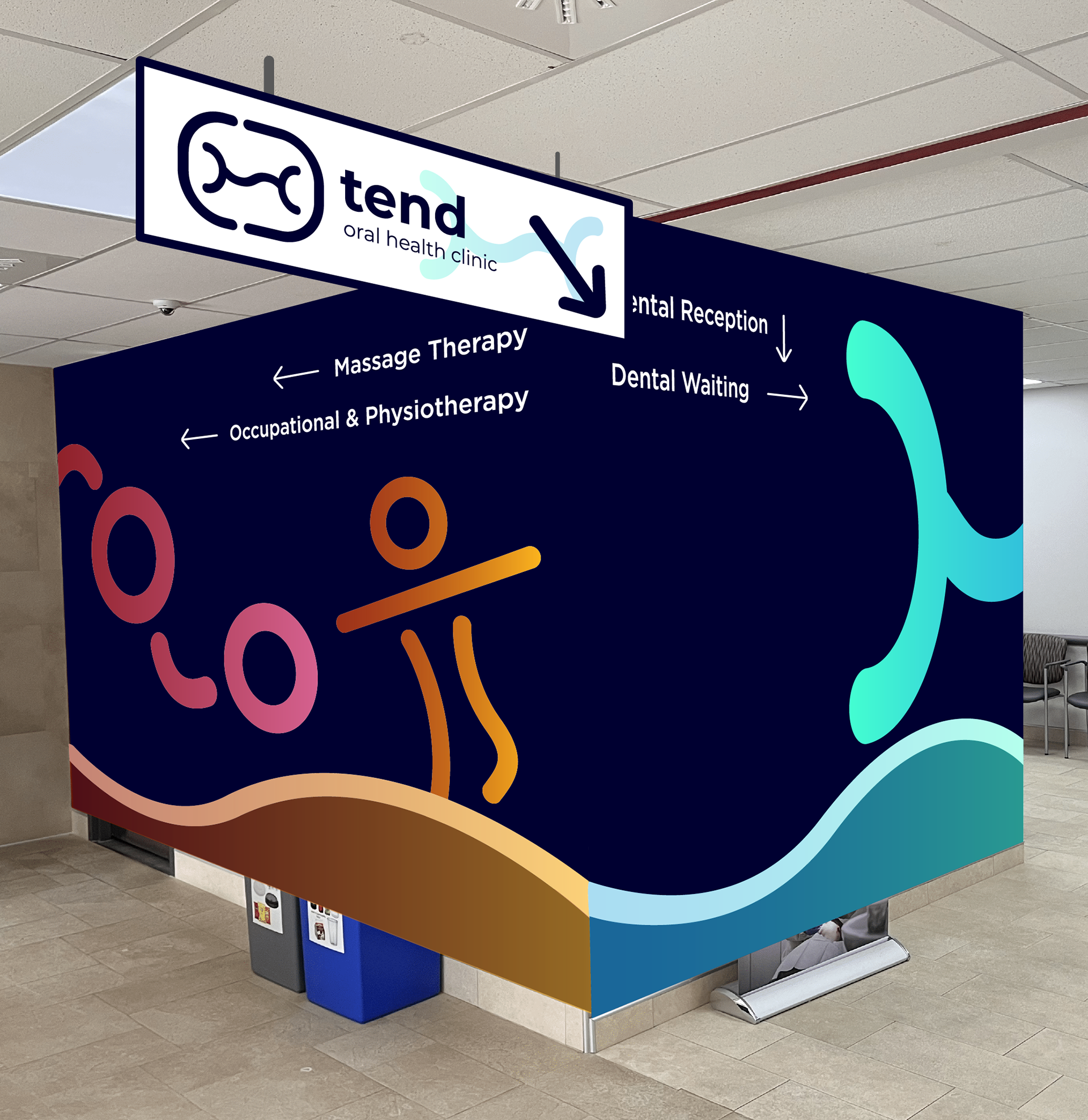
Wayfinding Wall Design with Directional Signage for Tend Reception
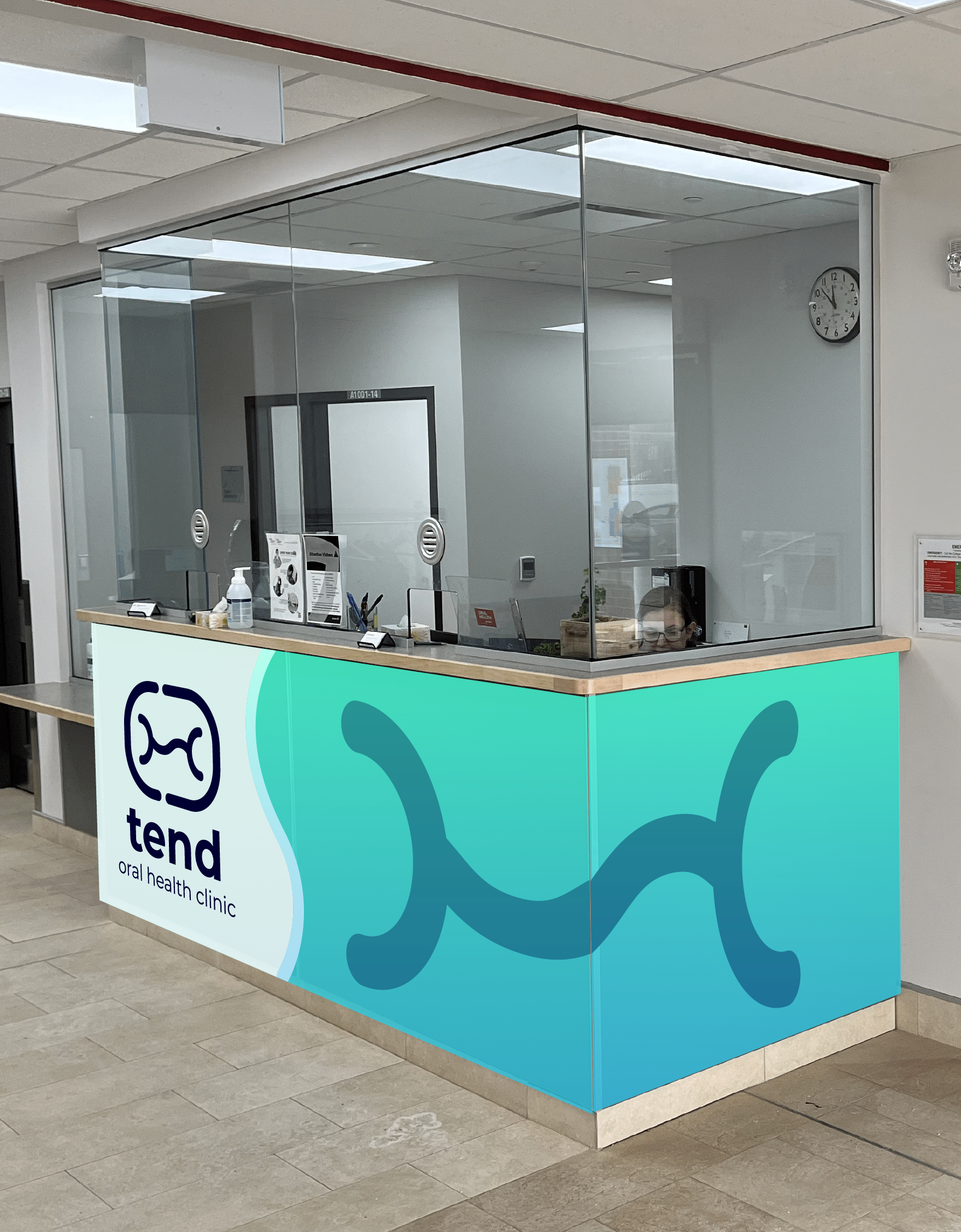
Tend Oral Health Reception Desk
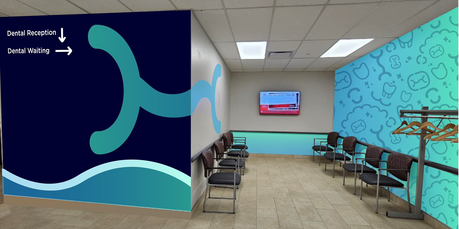
Tend Wayfinding Wall & Waiting Room
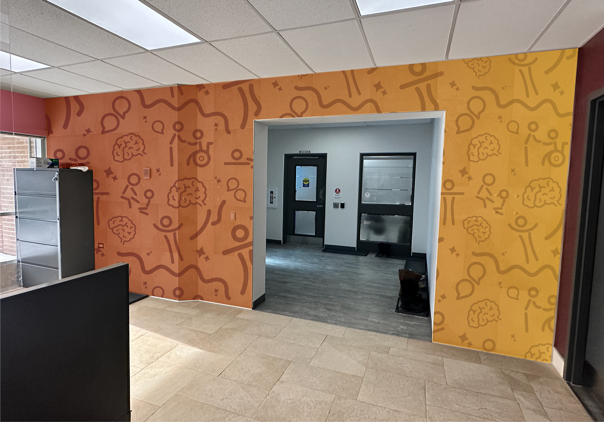
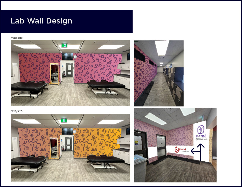
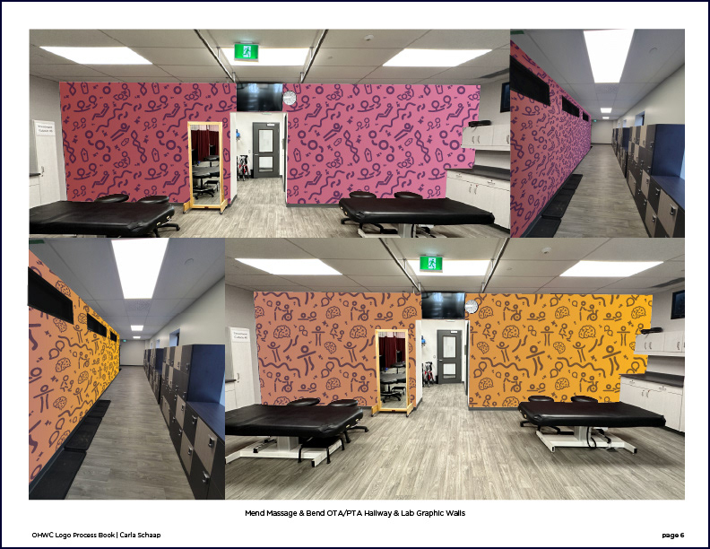
Hallway Designs leading to labs for Mend Massage & Bend Occupational/Physiotherapy
Lab Wall Designs for Mend & Bend
Below is the short client presentation briefing logo process and usage, with design mockups of the clinic spaces.
Intro
Logo Designs
Logo Style Guide & Branding for Tend Oral Health Clinic
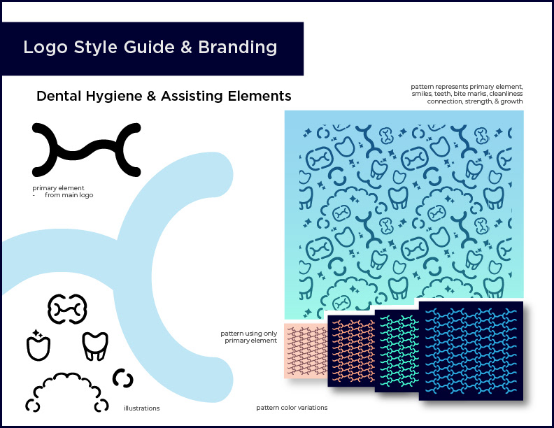
Tend Branding Elements
Logo Style Guide & Branding for Mend Student Massage Clinic
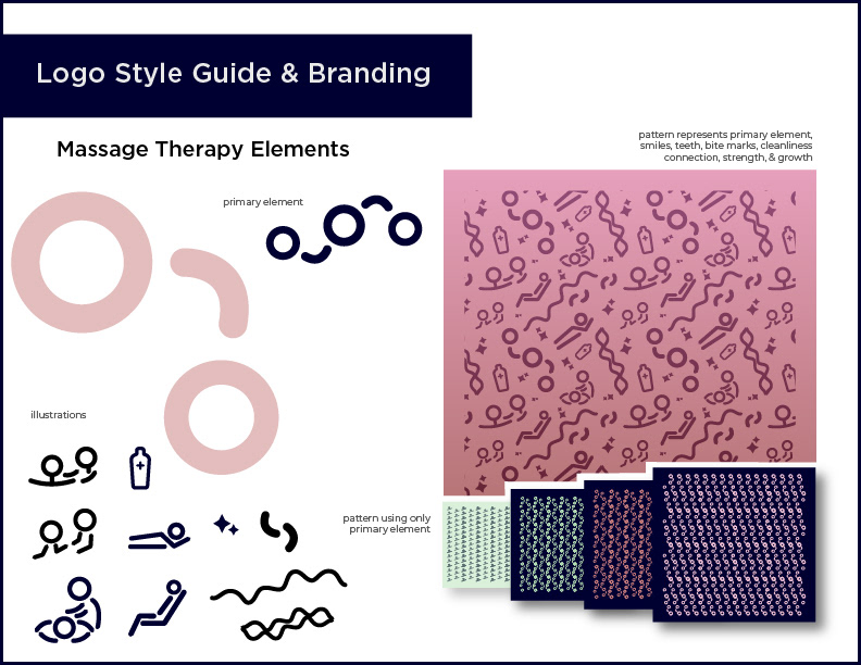
Mend Branding Elements
Logo Style Guide & Branding for Bend Occupational & Physiotherapy Clinic
Bend Branding Elements
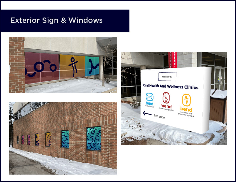
Exterior Sign & Window Graphics
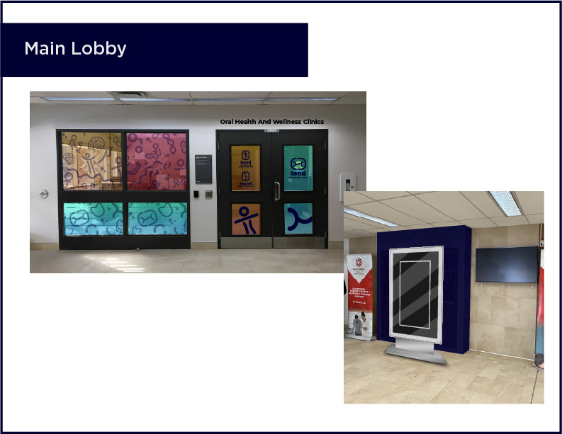
Main Lobby Designs
Reception & Waiting Area Designs
Lab Wall Designs
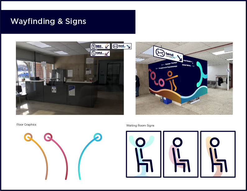
Wayfinding & Directional Signage Designs
Below are the Logo Style Guides for each clinic logo.
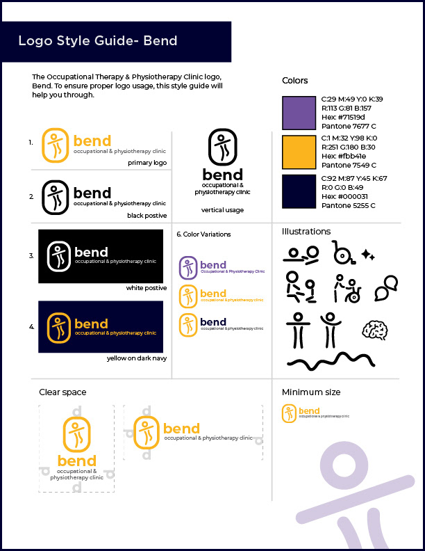
Bend Logo Style Guide
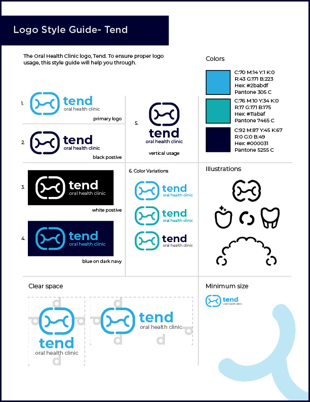
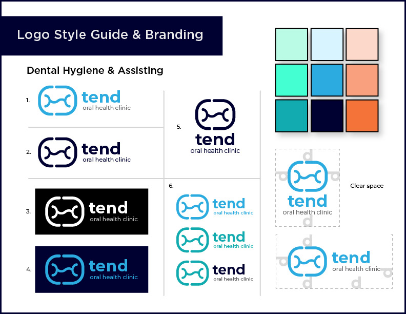
Tend Logo Style Guide
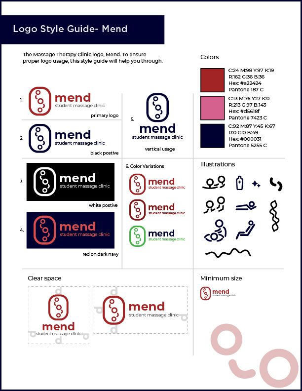
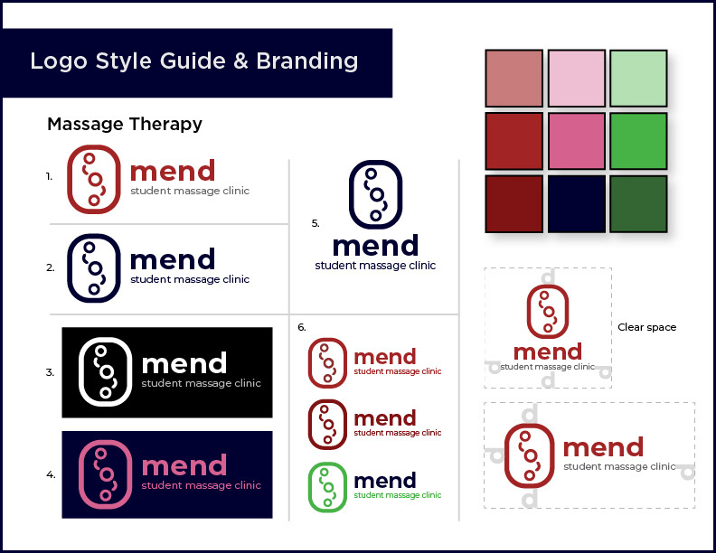
Mend Logo Style Guide
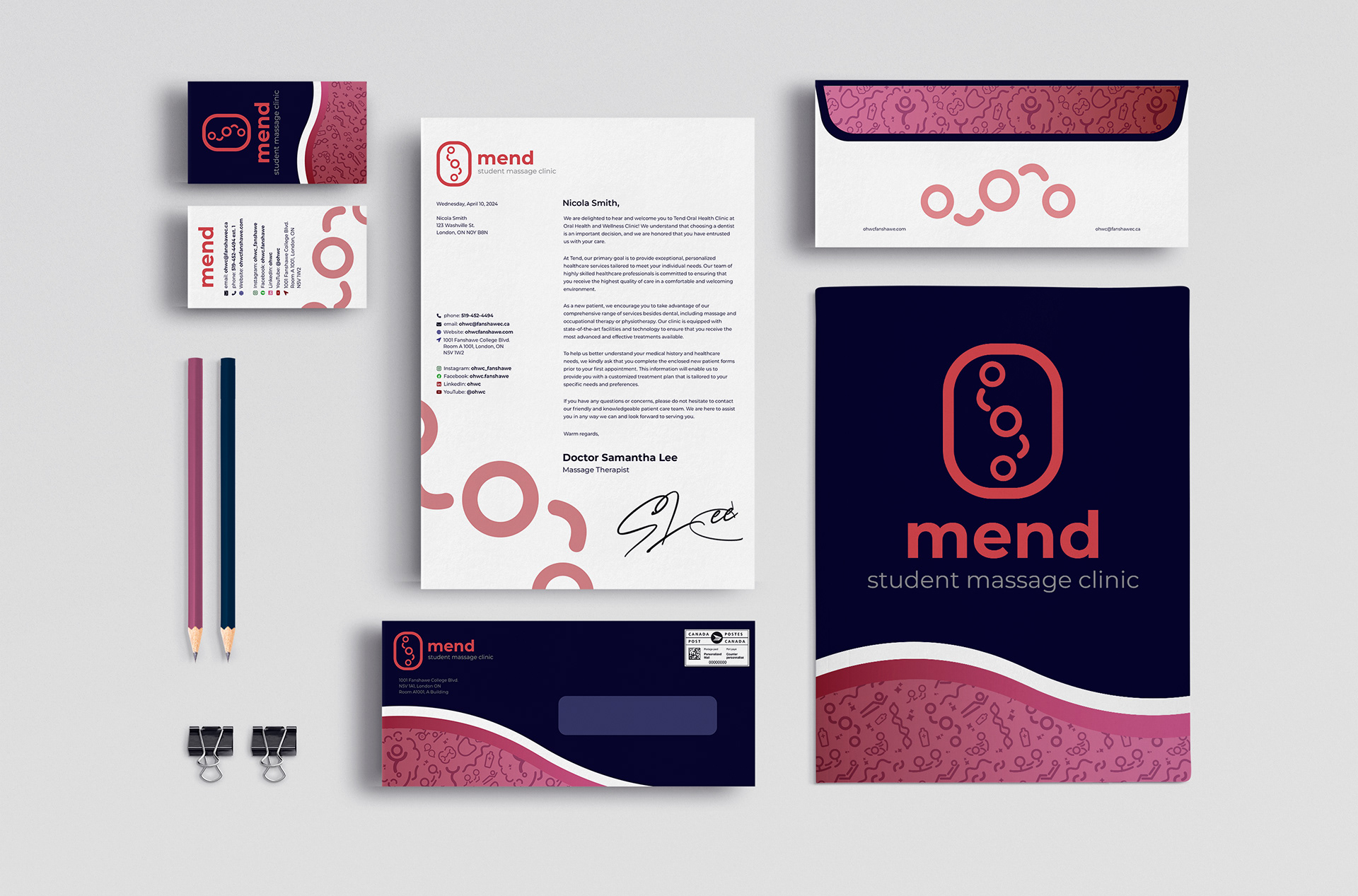
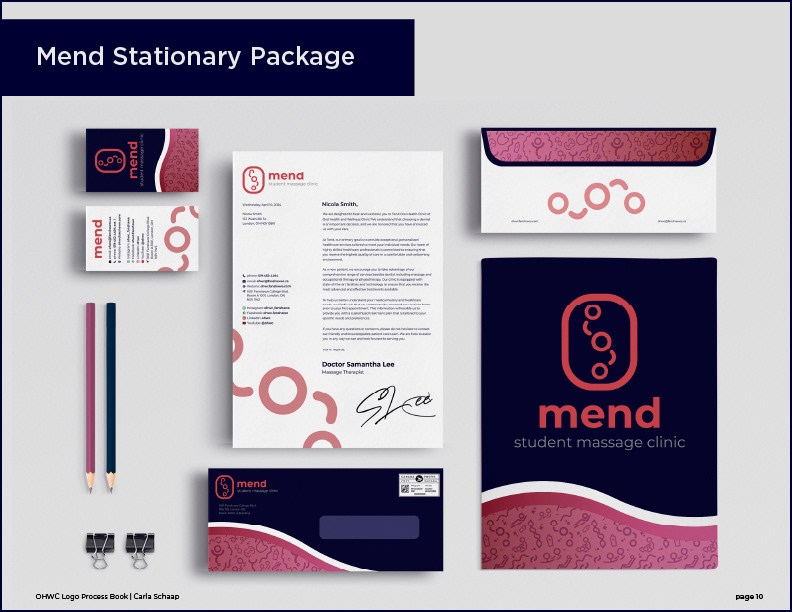
Mend Student Massage Clinic Stationary Identity Package
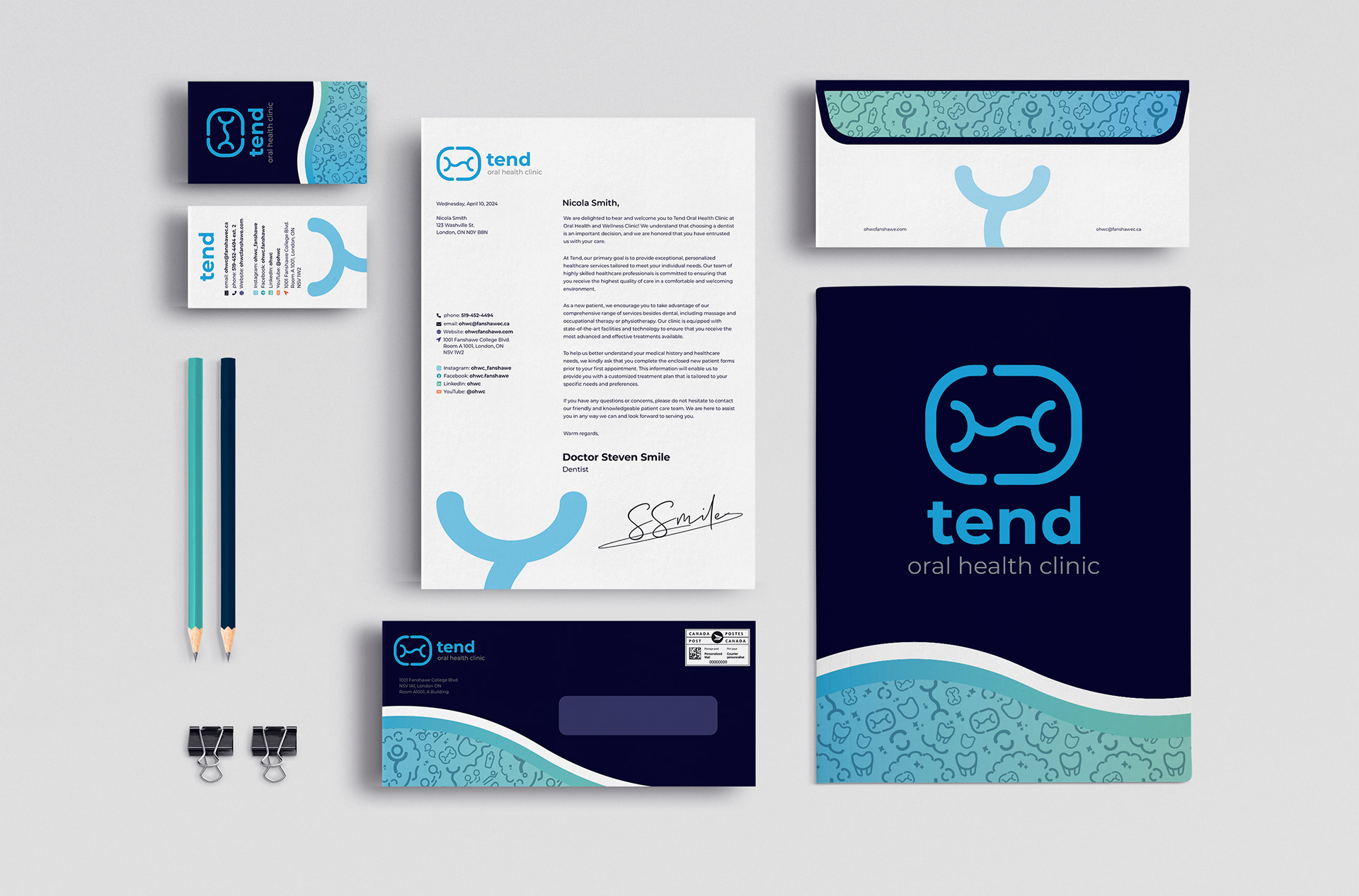
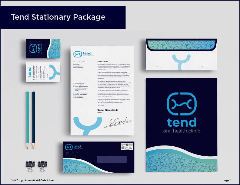
Tend Oral Health Clinic Stationary Identity Package
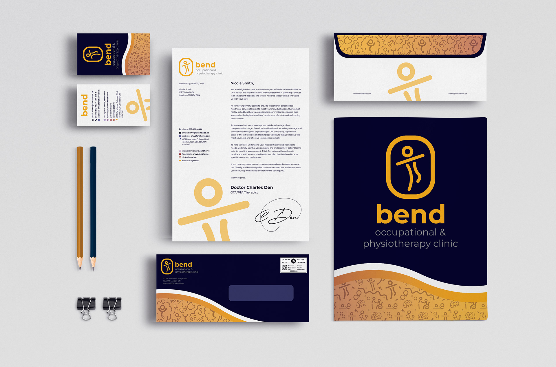
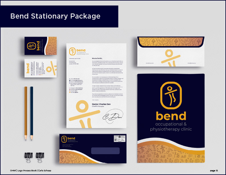
Bend Occupational & Physiotherapy Clinic Stationary Identity Package
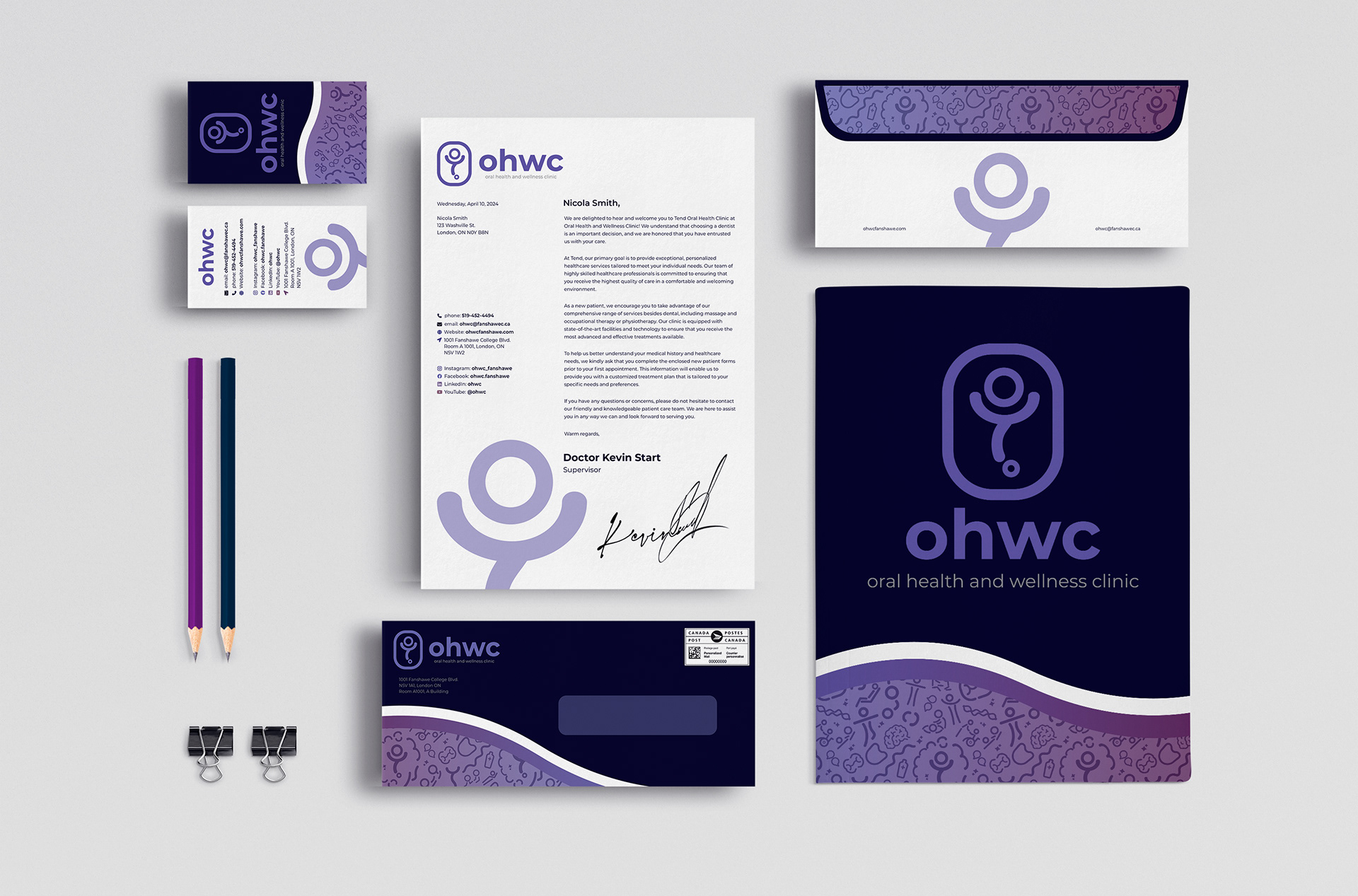
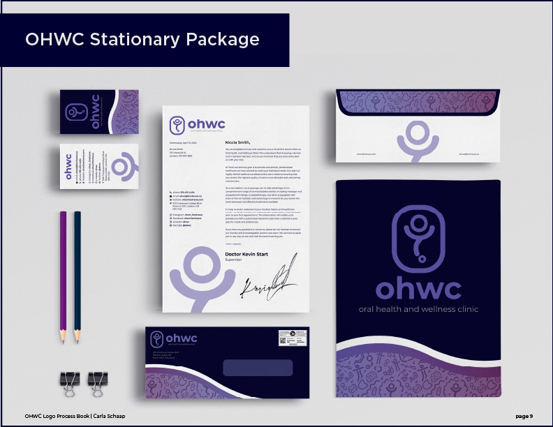
Oral Health & Wellness Clinic Stationary Identity Package
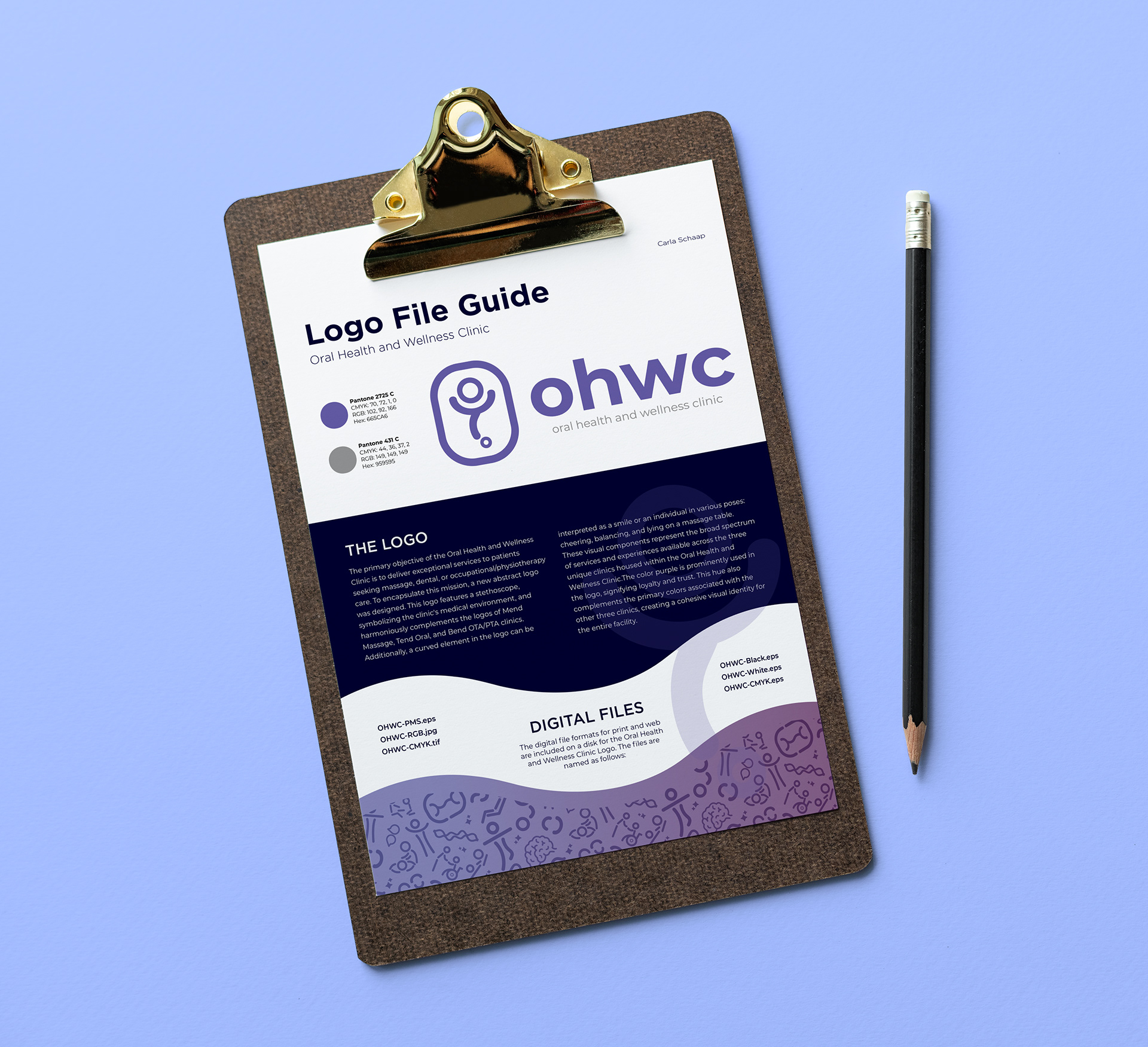
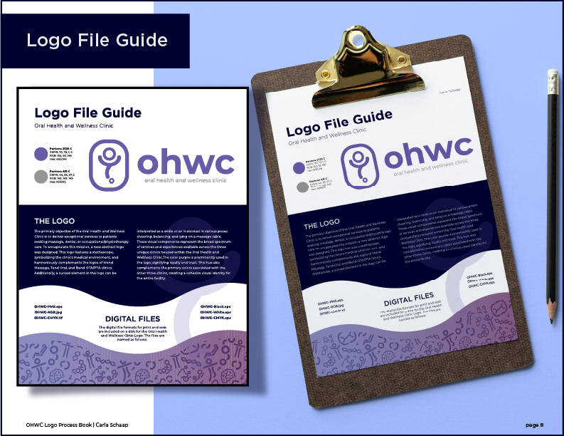
Oral Health & Wellness Clinic brief Logo File Guide.
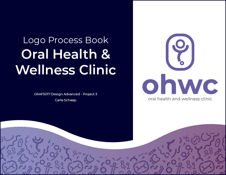
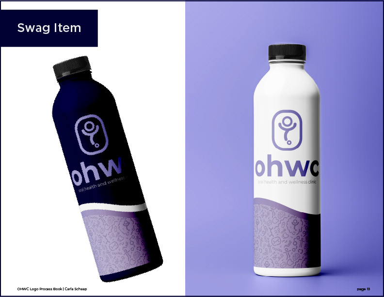
Below is the Logo Process Book for Oral Health & Wellness Clinic detailing the research, environmental graphics, the final logo for OHWC, merchandise, and stationary identity for each clinic.
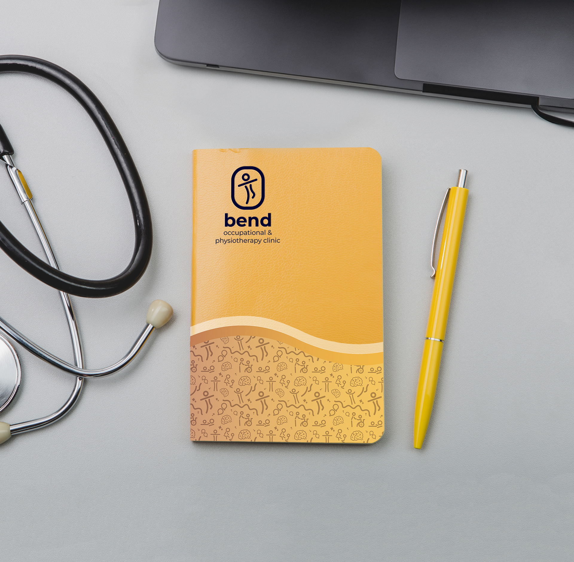
Bend Notebook
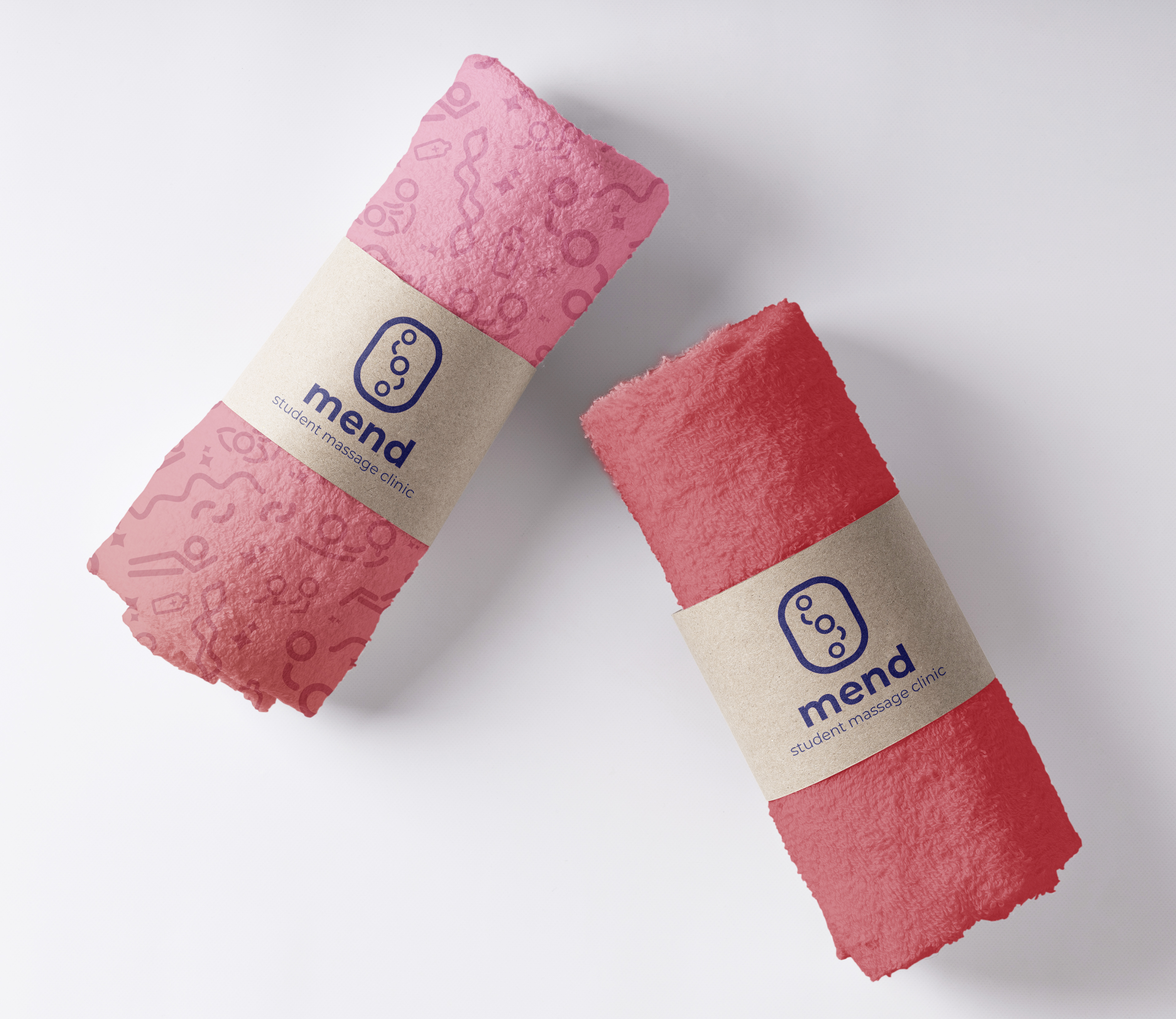
Mend Massage Towels
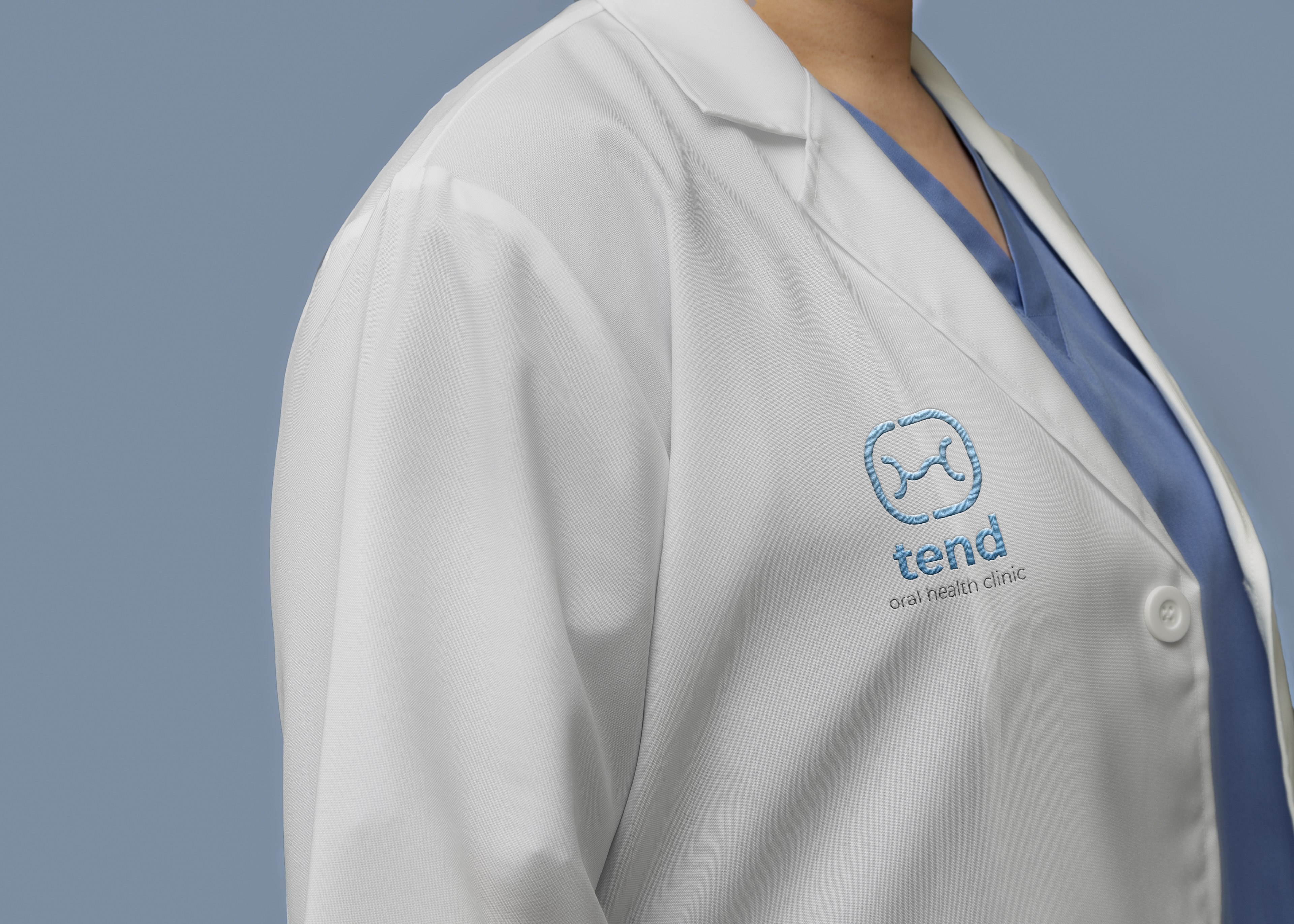
Tend Dentist Lab Coat
Process
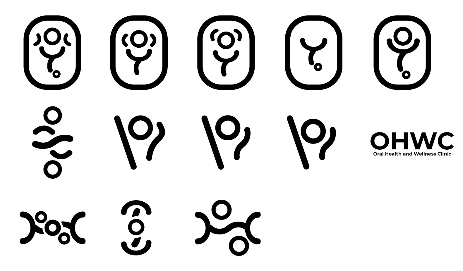
I began this project by conceptualizing names for the clinic's programs, aiming to create a cohesive theme with matching spelling and rhythmic quality. Given the established name and logo of the Mend Student Massage Clinic, I proposed naming the occupational and physiotherapy clinic "Bend," symbolizing the bending and movement involved in everyday tasks. For the oral health clinic, I suggested "Tend," reflecting the meticulous care and attention dentists provide to teeth and oral hygiene. These names and themes complement the existing Mend clinic while embracing each program's core focus and services.
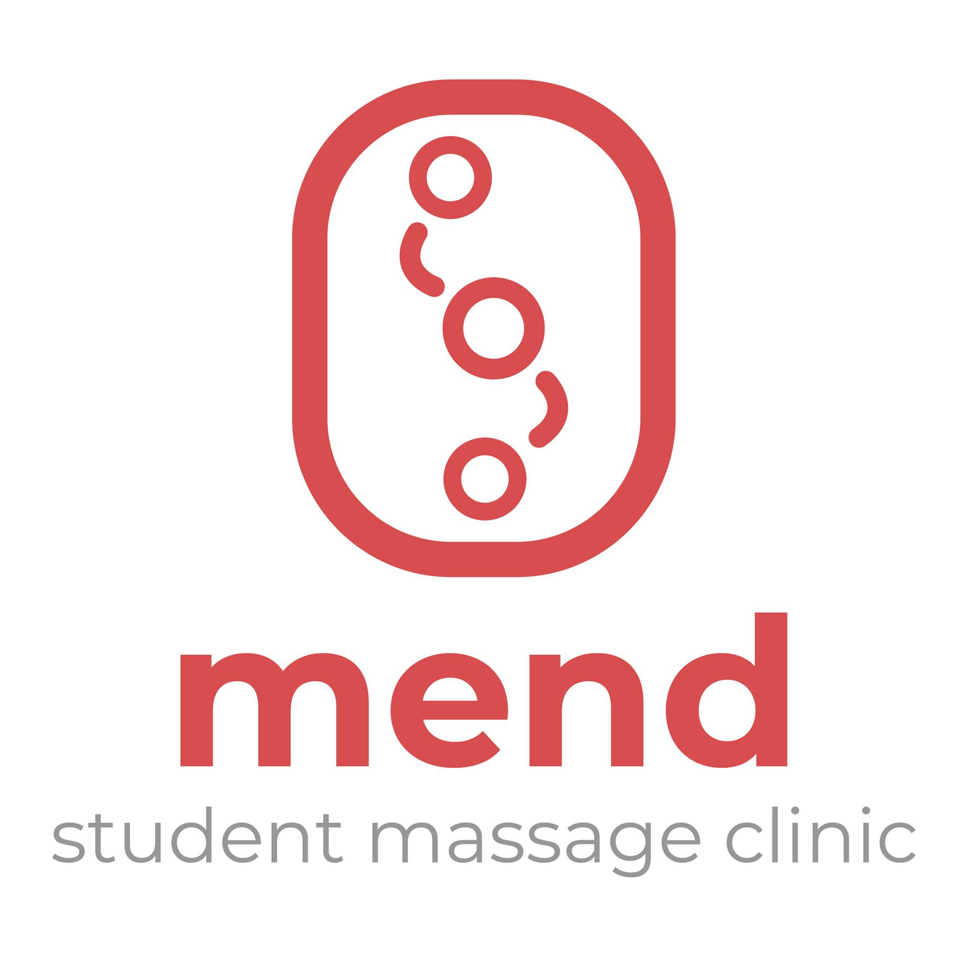
I began by sketching simplified designs that capture the essence of each program's services while avoiding clichés and common symbols. With the Mend Student Massage logo established in 2015, I saw this as an opportunity to enhance it while exploring various styles. To evoke the idea of support, care, rehabilitation, professionalism, and focus, a rounded square surrounds the pictorial portion to provide a structured look, balancing the friendly and dynamic abstract design. This shape draws attention and allows for a cohesive visual element while representing being part of the safe, educational, and large community of Fanshawe College. For all the logos, lowercase letters for the clinic name foster approachability and friendliness while maintaining a modern, simple, and clean style. The lowercase letters also create a smoother visual flow that complements the curves and straight lines used in the design.
In studying the existing Mend logo, I found a few elements that I wanted to continue and incorporate into the other clinic program logos for a cohesive identity. I particularly liked the dots forming a 'spine,' as they give the logo a friendly yet professional look. However, the typography lacks friendliness and appears very basic. With my new Mend logo design, I retained the open dot and spine look but added curved strokes to create an abstract representation of arms massaging. This addition enhances the friendly and professional feel while visually conveying the essence of the student-learning massage clinic. I focused on using rounded strokes in the logo designs to ensure friendliness and professionalism, maintaining continuity with the existing Mend logo's theme and visual identity.
I retained the colour red for the logo as it symbolizes energy, vitality, and passion—attributes that align perfectly with the essence of a massage therapy clinic. This colour choice is designed to evoke a sense of warmth and comfort, essential elements of a soothing and healing massage experience. Red is associated with muscles and the flushed, rejuvenated skin that follows a satisfying massage. Additionally, red can stimulate strength and motivation, reinforcing the clinic's commitment to therapeutic services and creating a welcoming atmosphere for clients seeking relaxation and relief.
Existing and Old Mend Student Massage Clinic Logo
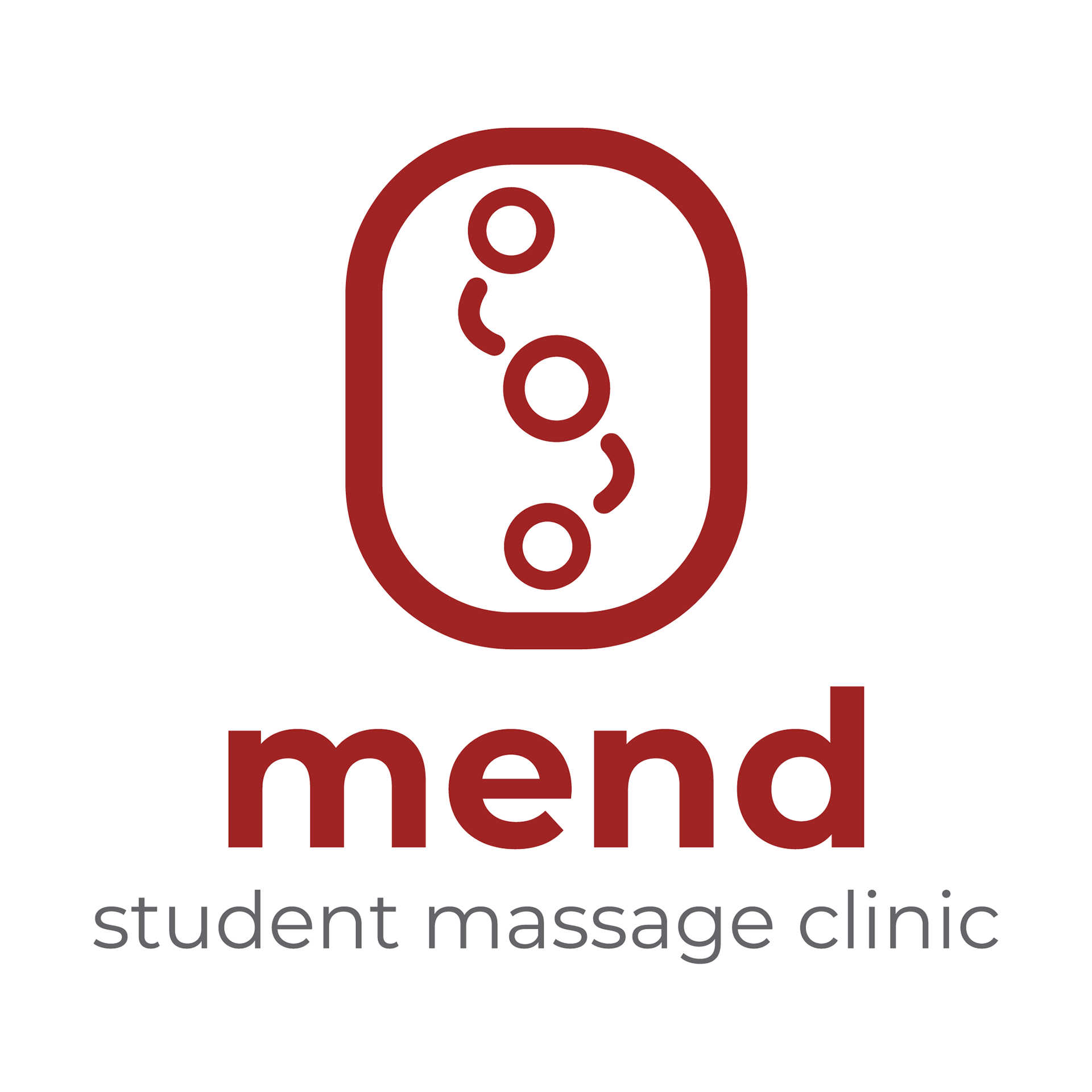
Revised Mend Clinic
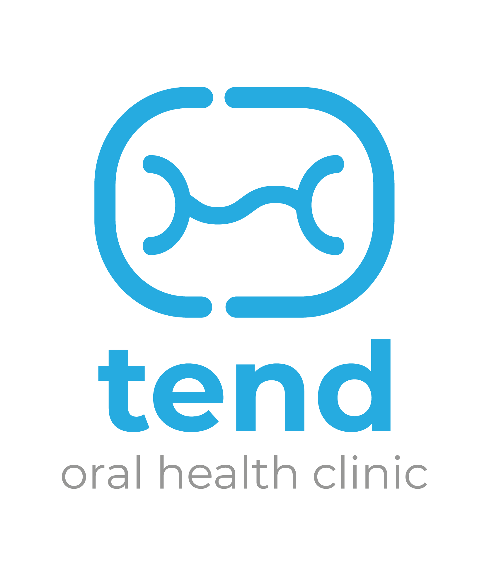
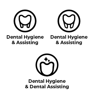
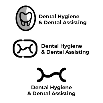
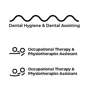
When creating the Tend Oral Health Clinic logo, I envisioned featuring an abstract tooth design that subtly hints at its identity. Unlike typical dental logos depicting equipment or specific tooth views, such as canines or incisors, I chose to represent oral health through the top view of a molar. A molar's natural contours and grooves inspired a flowing, wavy line reminiscent of the Mend logo, symbolizing dental tools like curettes and polishers. To add uniqueness, I incorporated a gap in the rounded square shape, subtly alluding to both a tooth's structure and the concept of cavities.
I chose blue to evoke a sense of cleanliness, reflecting the hygienic standards expected in a healthcare setting. It also conveys calmness, which can help alleviate the anxiety often associated with dental visits. Moreover, blue is widely associated with trust, making patients feel reassured and comfortable in the clinic environment. Using blue prominently in the design, I aimed to instill a sense of professionalism and reliability, reinforcing the clinic's commitment to patient care and well-being.
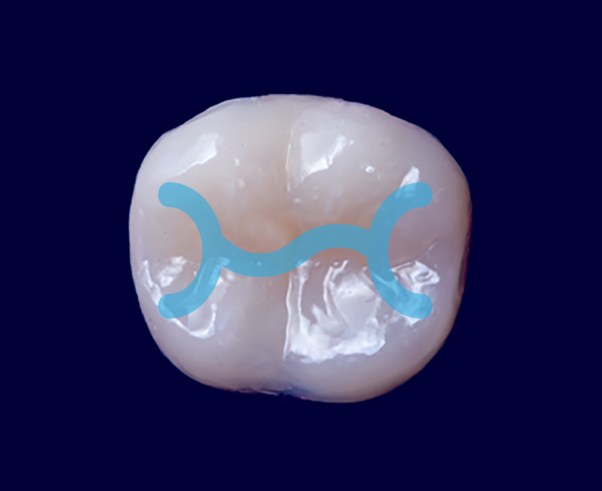
Top View of Molar Tooth
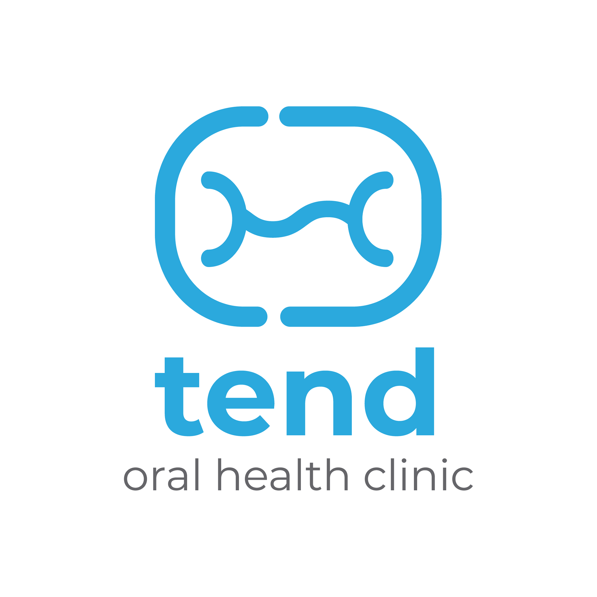
Tend Clinic Logo
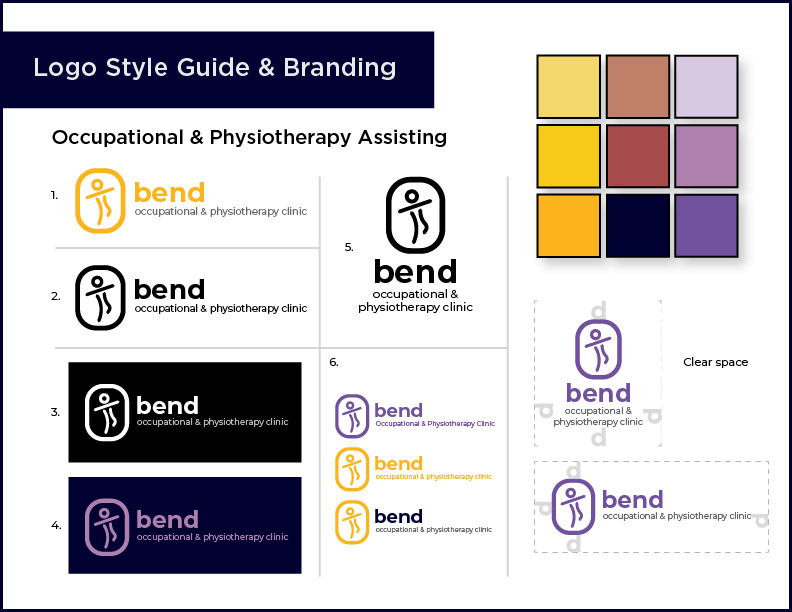
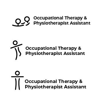
When designing the Bend logo, I incorporated elements from the Mend and Tend clinic logos to maintain a cohesive visual identity. I used the dots from the Mend logo to represent continuity and connection. It also features a simple human figure balancing, integrating straight and wavy, curved lines from the Mend & Tend logo to add a dynamic and fluid element, symbolizing movement and flexibility, which are key aspects of occupational and physiotherapy. This approach ensures that the logo aligns with the overall clinic branding and effectively communicates the specific services and values of the Bend Occupational Therapy and Physiotherapy Clinic.
I chose yellow to make this logo express warmth, positivity, and hope while standing out and capturing attention. Yellow is associated with happiness and energy, which aligns perfectly with the clinic's goals to foster an uplifting and optimistic environment. Additionally, yellow is highly visible and easily draws attention, ensuring it is recognizable. This vibrant colour also differentiates the brand from other healthcare logos, often using more subdued tones like blue and green.
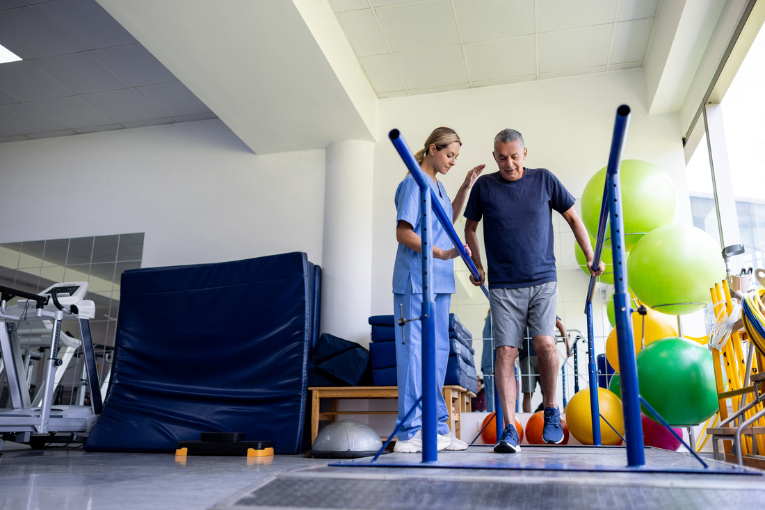
Woman assisting elder with physiotherapy
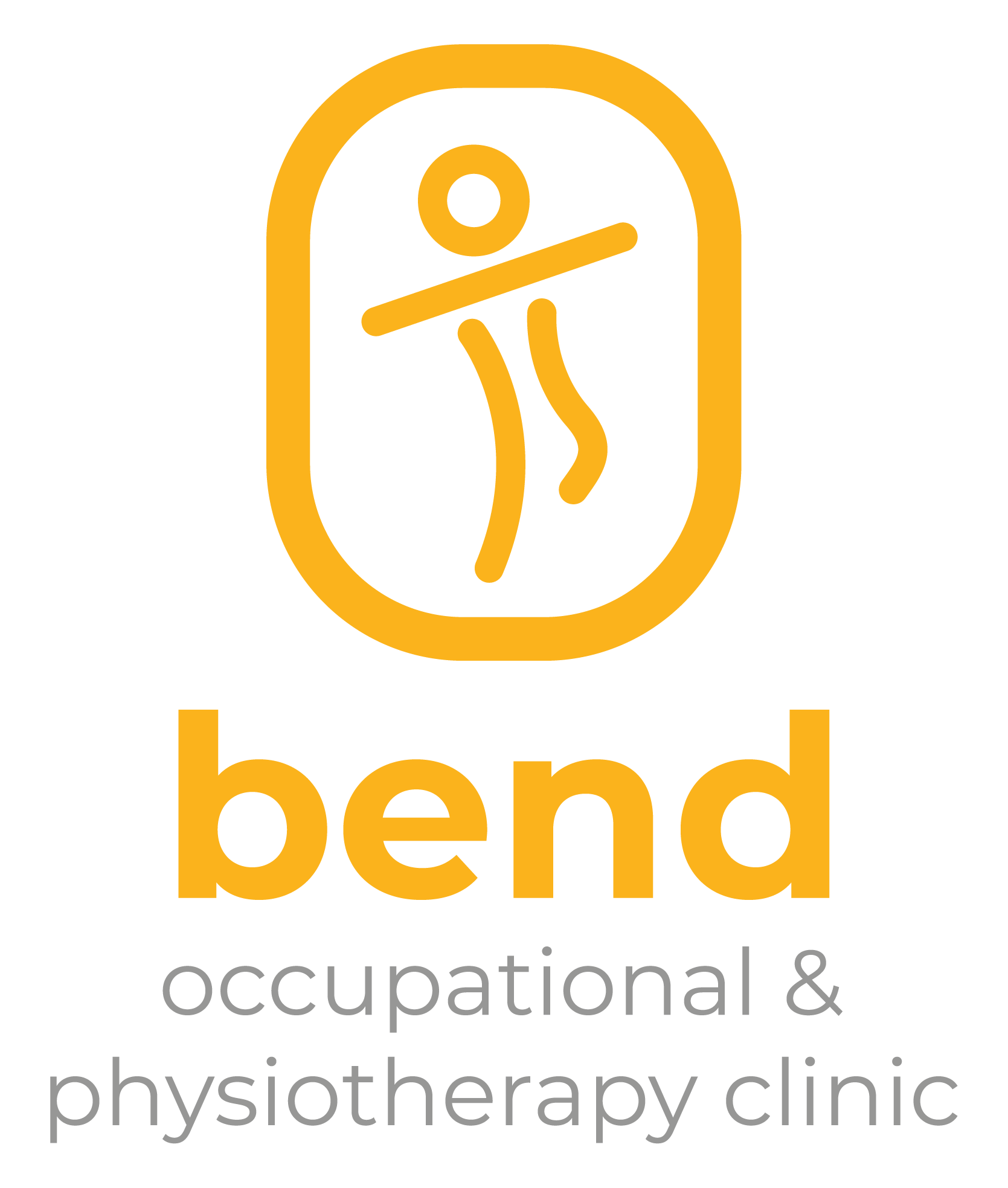
Bend Clinic Logo
For the Oral Health & Wellness Clinic logo, I wanted it to represent the three clinics within by utilizing the same shapes and considering the primary objective of the clinic. The abstract logo features a stethoscope, symbolizing the clinic's medical environment, and harmoniously complements the logos of Mend Massage, Tend Oral, and Bend OTA/PTA clinics.
Additionally, a curved element in the logo can be interpreted as a smile or an individual in various poses: cheering, balancing, lying on a massage table or sitting on a dentist chair. These visual components represent the broad spectrum of services and experiences available across the three unique clinics housed with the Oral Health and Wellness Clinic.
The logo prominently uses purple, which signifies loyalty and trust. It communicates a sense of reliability and integrity and harmonizes with the primary colours used in the other three clinics, establishing a unified and cohesive identity for the entire facility. It helps convey a commitment to trustworthy service and a welcoming environment across all branches, enhancing recognition and consistency while reinforcing the facility's dedication to excellence and patient care.
For the environmental designs, my approach was to carefully select colours and patterns that align with each clinic's unique identity. Each clinic's design reflects its specific focus and atmosphere, ensuring the visual elements enhance the patient experience.
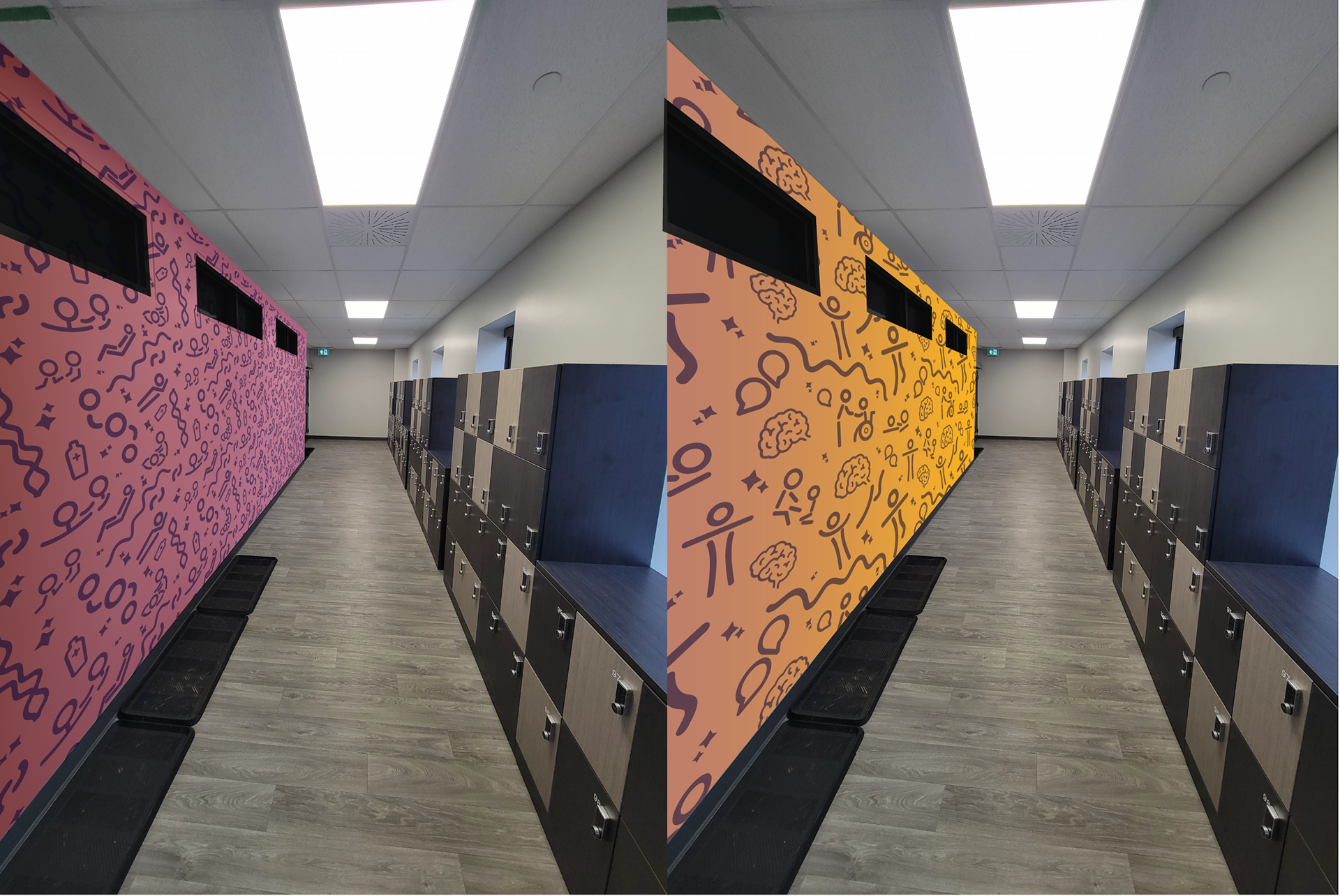
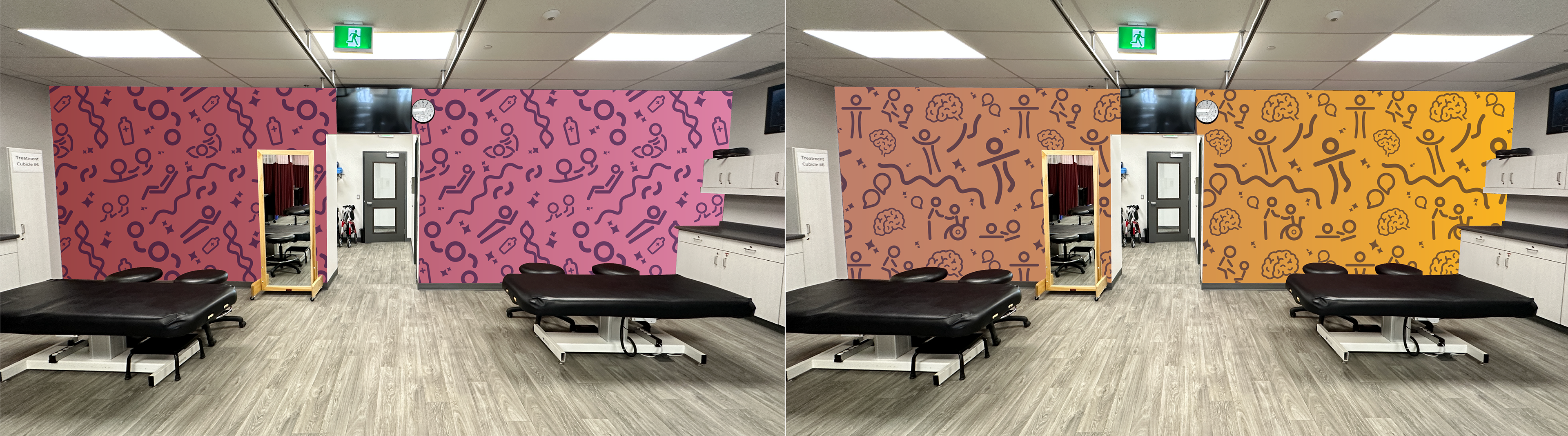
For Mend Student Massage Clinic, I designed icons that represent its services. With the primary logo element, these icons include patients on massage tables, therapists providing care, wavy lines representing spine and muscle bands, cream bottles, and sparks symbolizing healing. I combined these icons, creating a visually striking pattern that captures the essence of Mend Student Massage Clinic's services and creates an engaging and dynamic visual narrative. This approach enhances the clinic's identity, attracts attention, and communicates the essence of therapeutic care and wellness offered at Mend.
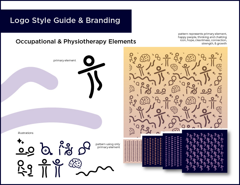
Designing the pattern for Bend Occupational & Physiotherapy Clinic presented a unique challenge due to the diverse nature of its services. To encapsulate its offerings, I designed a brain icon representing cognitive function, a wavy line representing progress and growth, speech bubbles signifying communication and dialogue between therapists and patients, wheelchair assisting, patients cheering or balancing, which reflects successful therapy outcomes, therapists providing care and support, and, once again, sparks symbolizing healing and growth.

Mend Massage Pattern

Bend Occupational & Physiotherapy Pattern
Designing the Tend Oral Health Clinic pattern was straightforward, as I integrated various icons. These included teeth, x-rays of a full set of teeth, canines, and incisors with the primary logo element. Additionally, I incorporated sparks to symbolize healing and cleanliness. This combination of icons visually represents the comprehensive dental services offered and communicates the clinic's commitment to oral health, cleanliness, and oral care.
By blending these diverse icons into one cohesive pattern, the design reflects the comprehensive range of services and integrative approach of the Oral Health & Wellness Clinic. This unified pattern visually communicates the clinic's dedication to overall health and well-being, creating a harmonious and integrated visual identity.

Tend Oral Health Pattern

Oral Health & Wellness Pattern
For the environmental and wayfinding graphics, I opted for a clean, minimalistic style with bold, bright colours representing the clinic logos and branding. The aim was to create a welcoming and professional atmosphere that is easy to navigate. Simplified, clutter-free graphics enhance the clinic's modern look, using ample white space to create a sense of calm and order. Each clinic's unique colour palette is prominently featured, ensuring clear differentiation while maintaining a cohesive overall identity. These designs instill a sense of pride among staff and patients, showcasing the clinics' commitment to excellence with engaging imagery. Clear, easy-to-read signage and interactive digital elements provide real-time information, enhancing the patient experience from entry to service. By combining these qualities, the environmental and wayfinding graphics enhance the clinics' visual appeal and reinforce their unique identities and dedication to patient care.
Medium/Tools Used
Adobe Illustrator
Adobe InDesign
Adobe Photoshop
Adobe After Effects
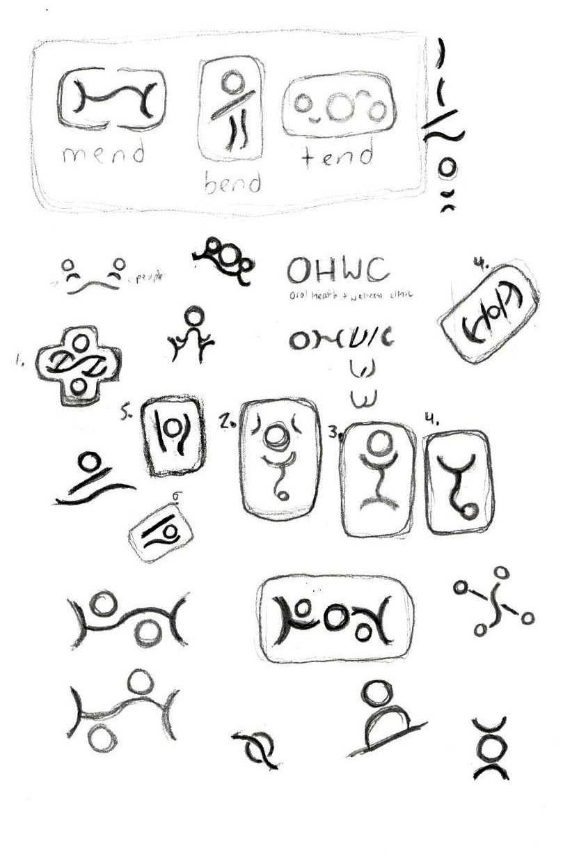
Logo Sketches
Logo Concepts for Tend Oral Health Clinic
More Logo Concepts for Tend
Logo Concepts for Bend Occupational & Physiotherapy Clinic
More Logo Concepts for Bend