Objective
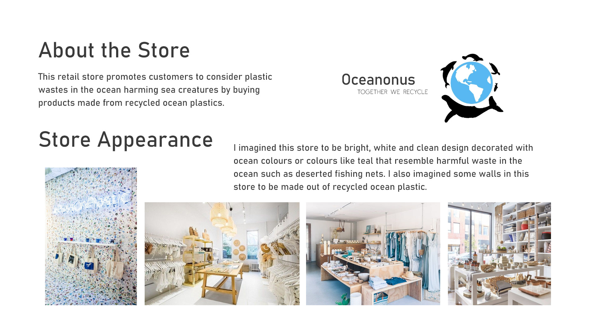
I conceptualized a store by deciding its type, genre, and name in this design project. This involved crafting a detailed description of the store’s physical appearance, outlining the range of products it would sell, identifying the target age group, and analyzing potential competitors in the market. Additionally, I was required to create a swatch book of various design patterns. The primary objective was to develop a pattern using the first letter of my first, middle, or last name to visually and thematically align with the store’s overall mood and purpose, enhancing its brand identity and appeal.
Process
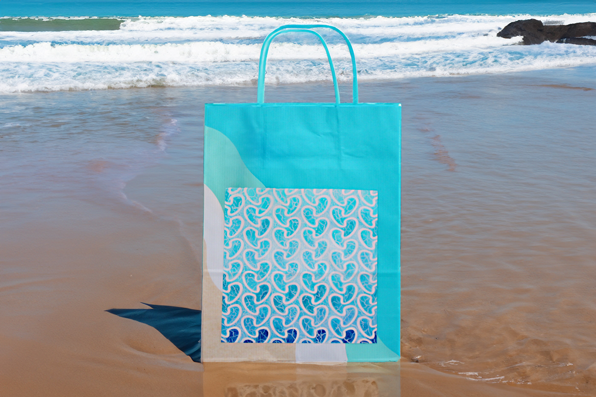
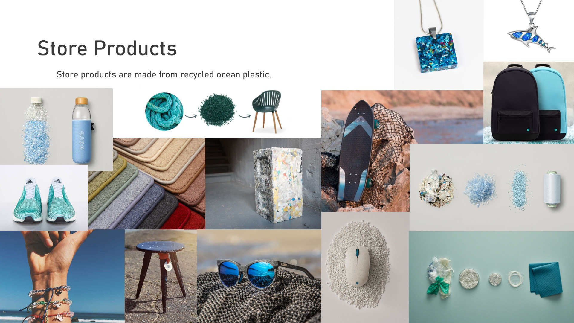
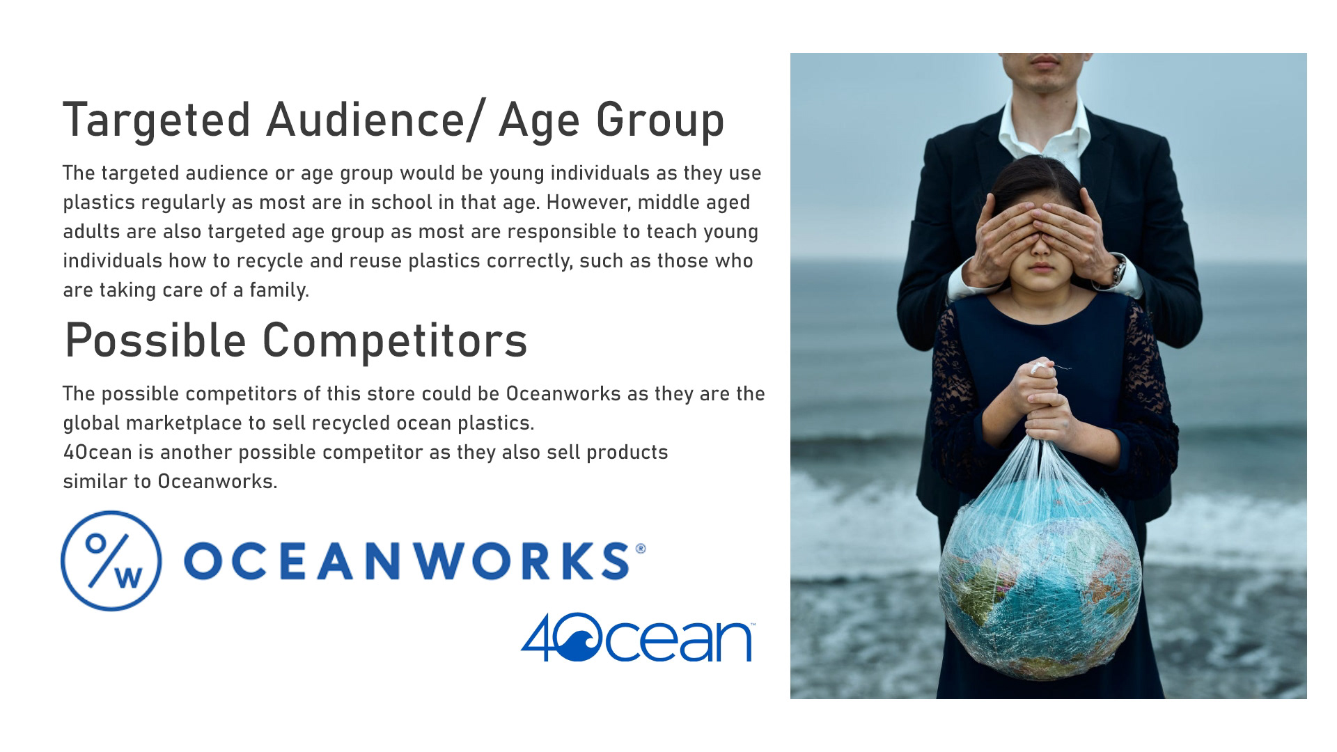
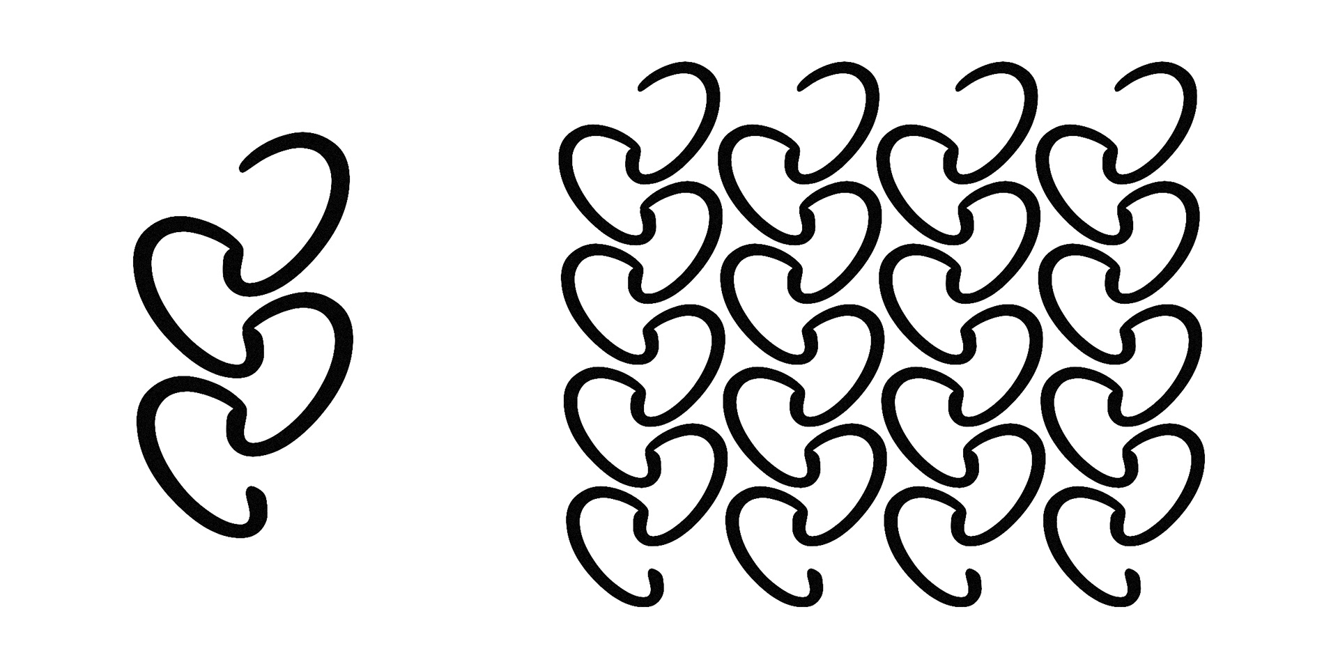
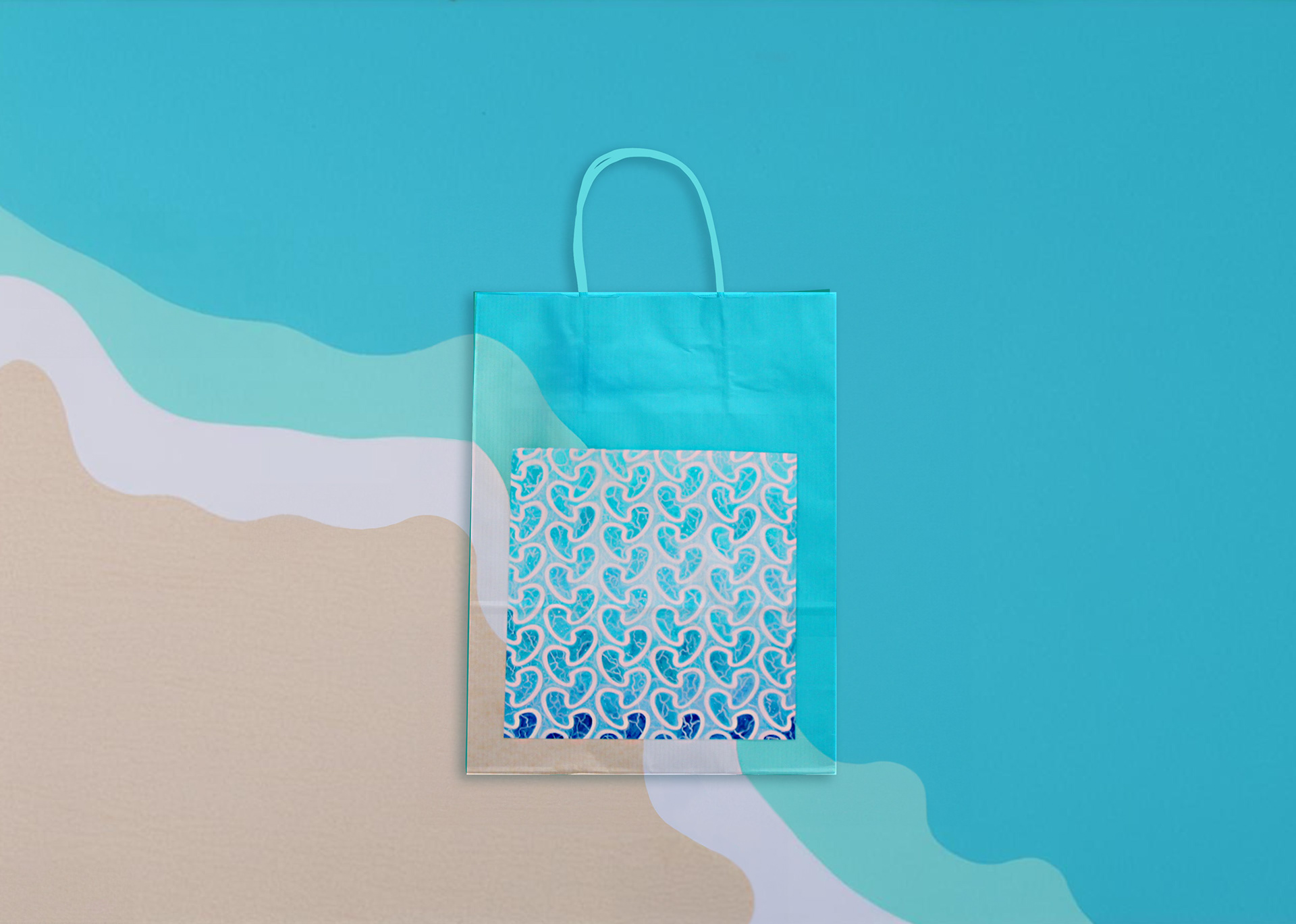
I decided to design a retail bag pattern for my imaginary store, Oceanonus, which promotes ocean health and sells products made from recycled ocean plastic waste. After researching the products the store would offer, the target demographic, and potential competitors, I began creating four different patterns. As part of the design challenge, I had to use the first initial of my name, "C," to form the patterns. Finally, I selected a font that would complement the store's name.
I developed patterns that resembled various ocean elements, such as whale flukes, seal flippers, fish, jellyfish, seashells, fishing nets, sea kelp, and other abstract shapes. The sea kelp pattern stood out as the most effective representation of my inspiration and design concept. I was informed that this pattern could evoke all the elements I had created—fins, jellyfish, and waves—making it a versatile and meaningful choice.
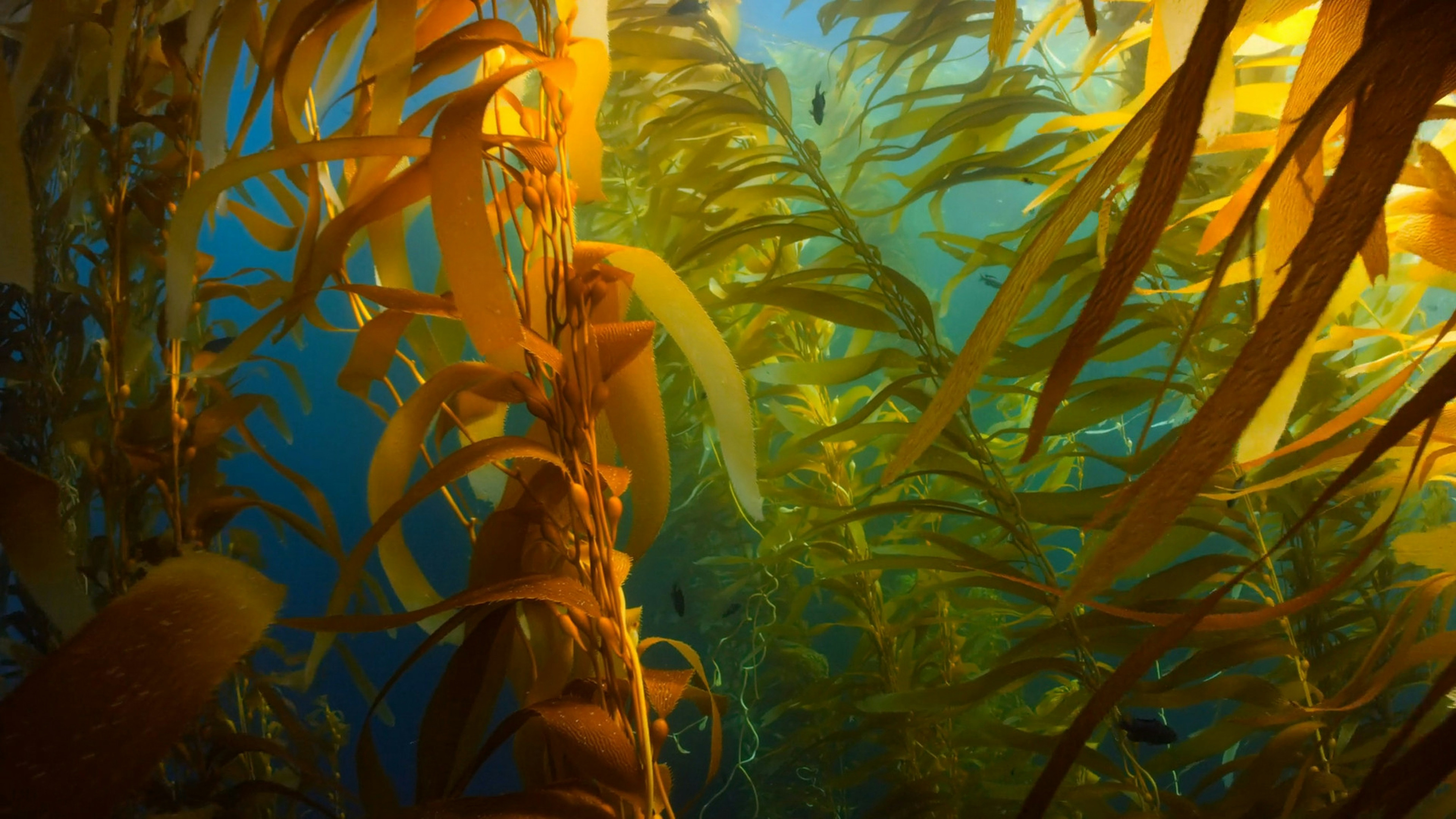
Sea Kelp inspiration picture from Unsplash
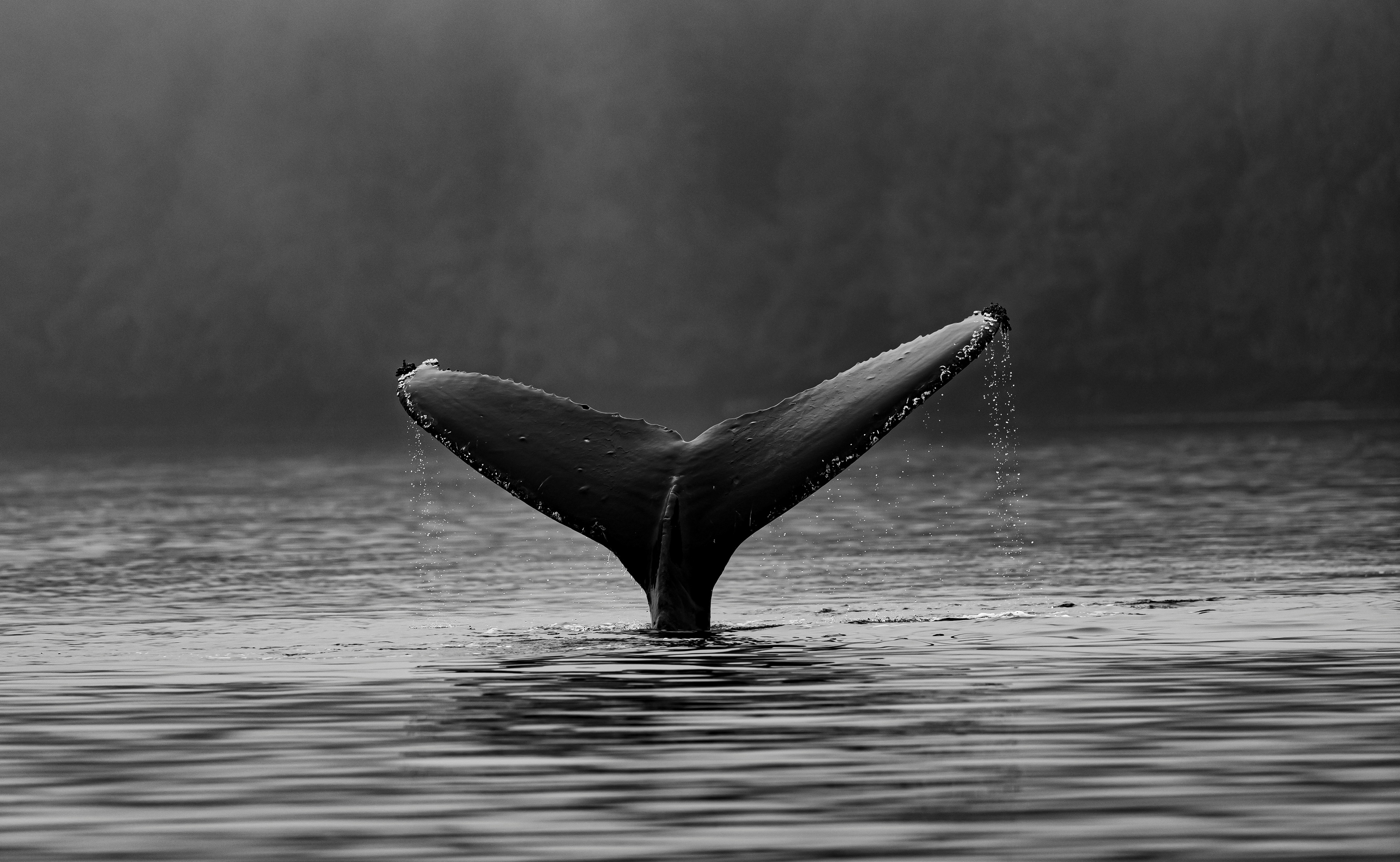
Whale Fluke inspiration picture from Unsplash
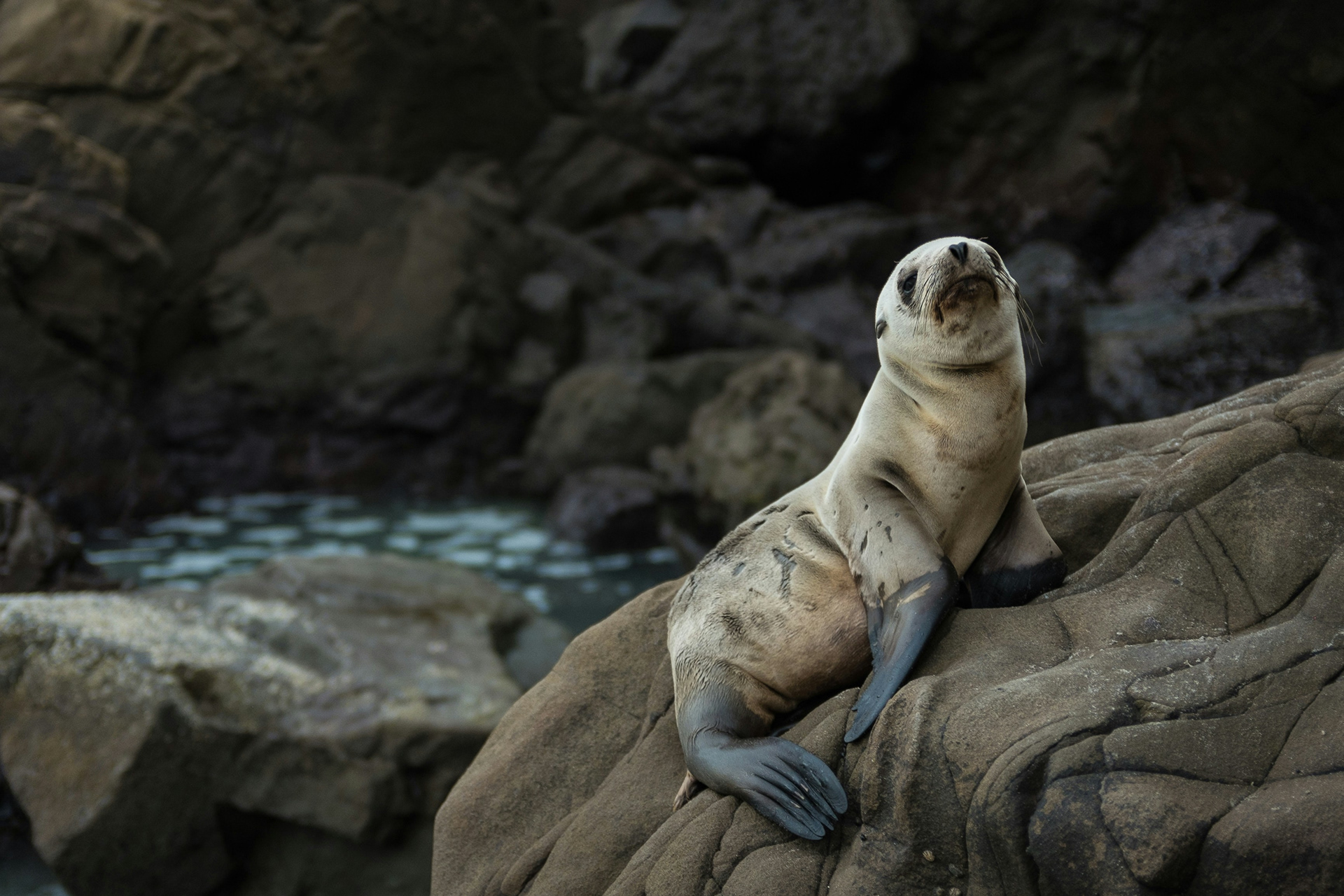
Seal inspiration picture from Unsplash
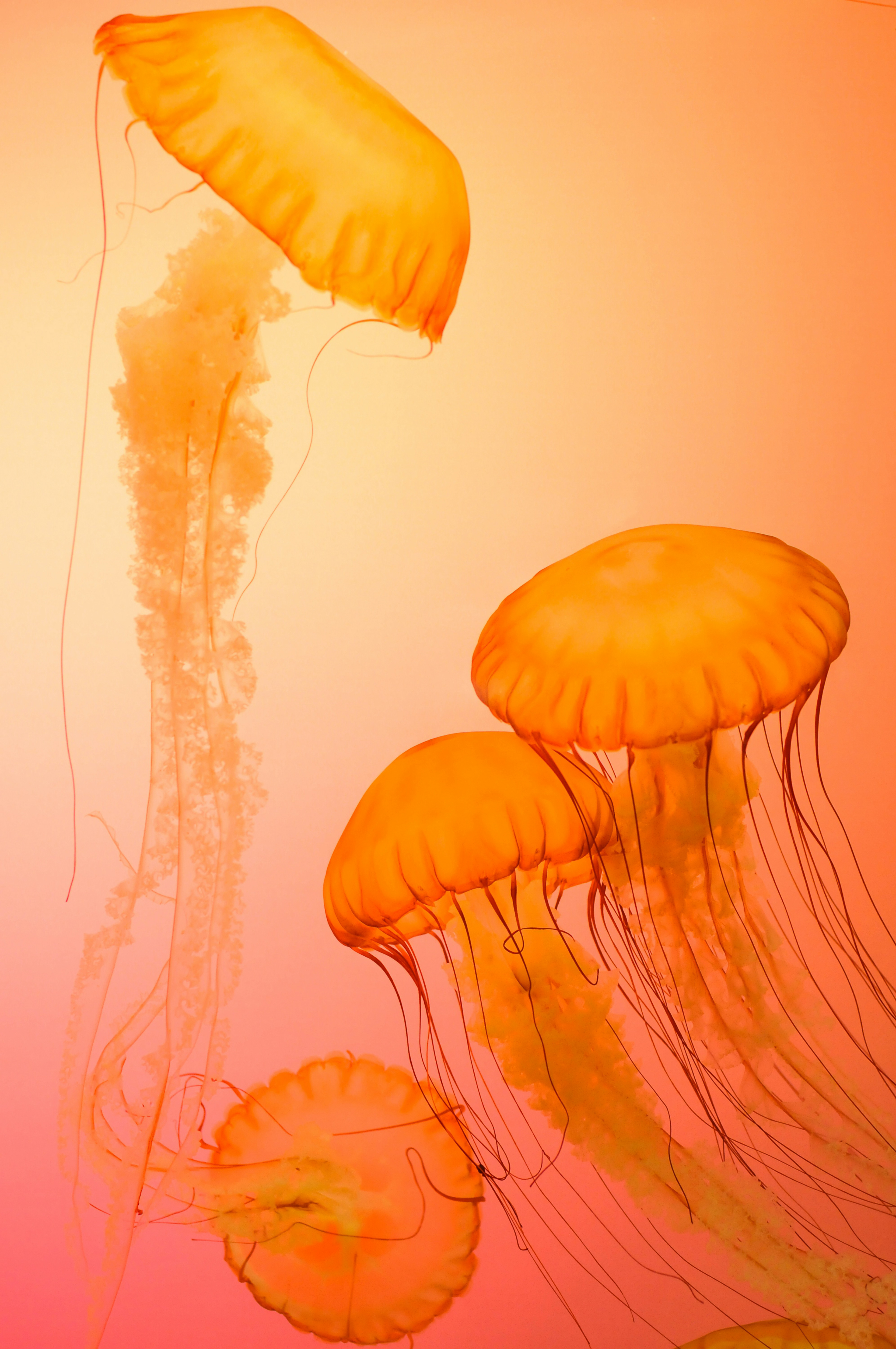
Jellyfish inspiration picture from Unsplash
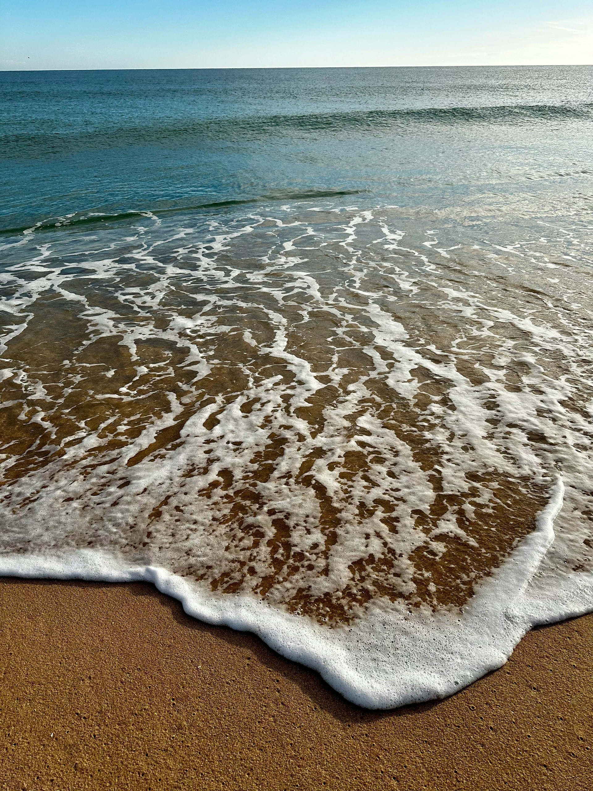
Foamy Waves inspiration picture from Unsplash
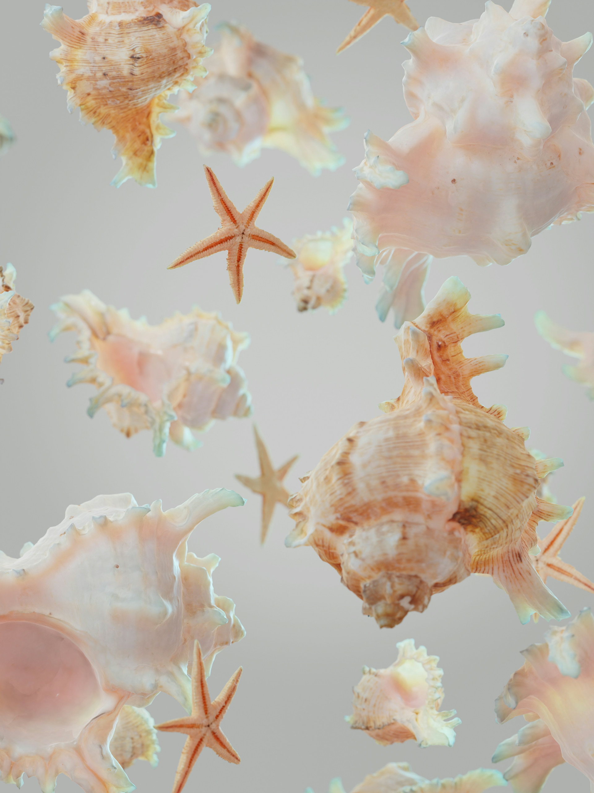
Seashells inspiration picture from Unsplash
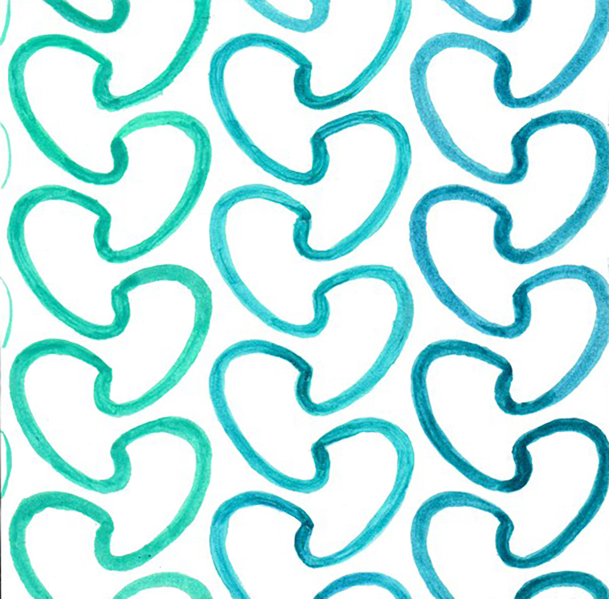
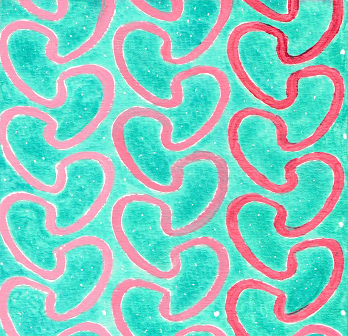
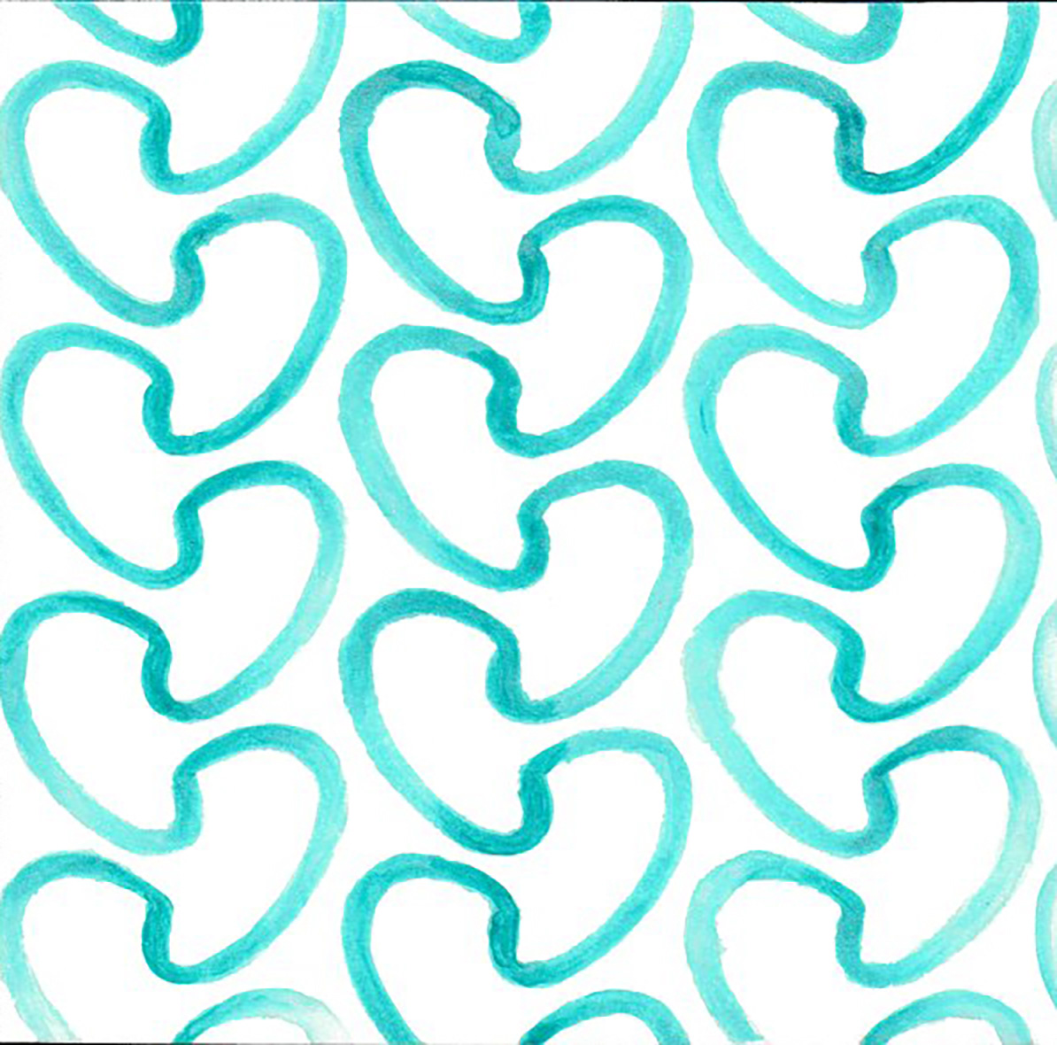
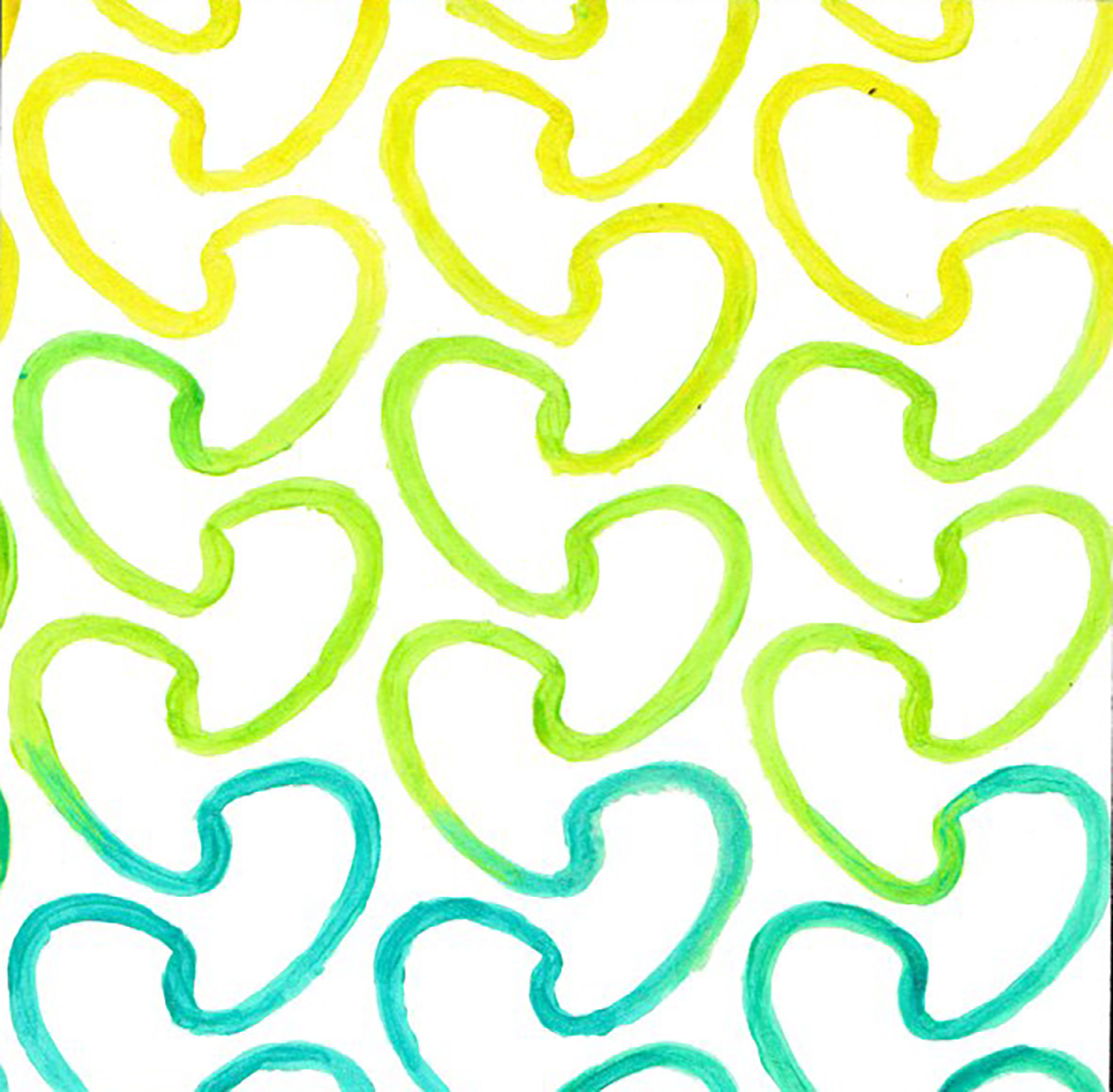
Swatch 1
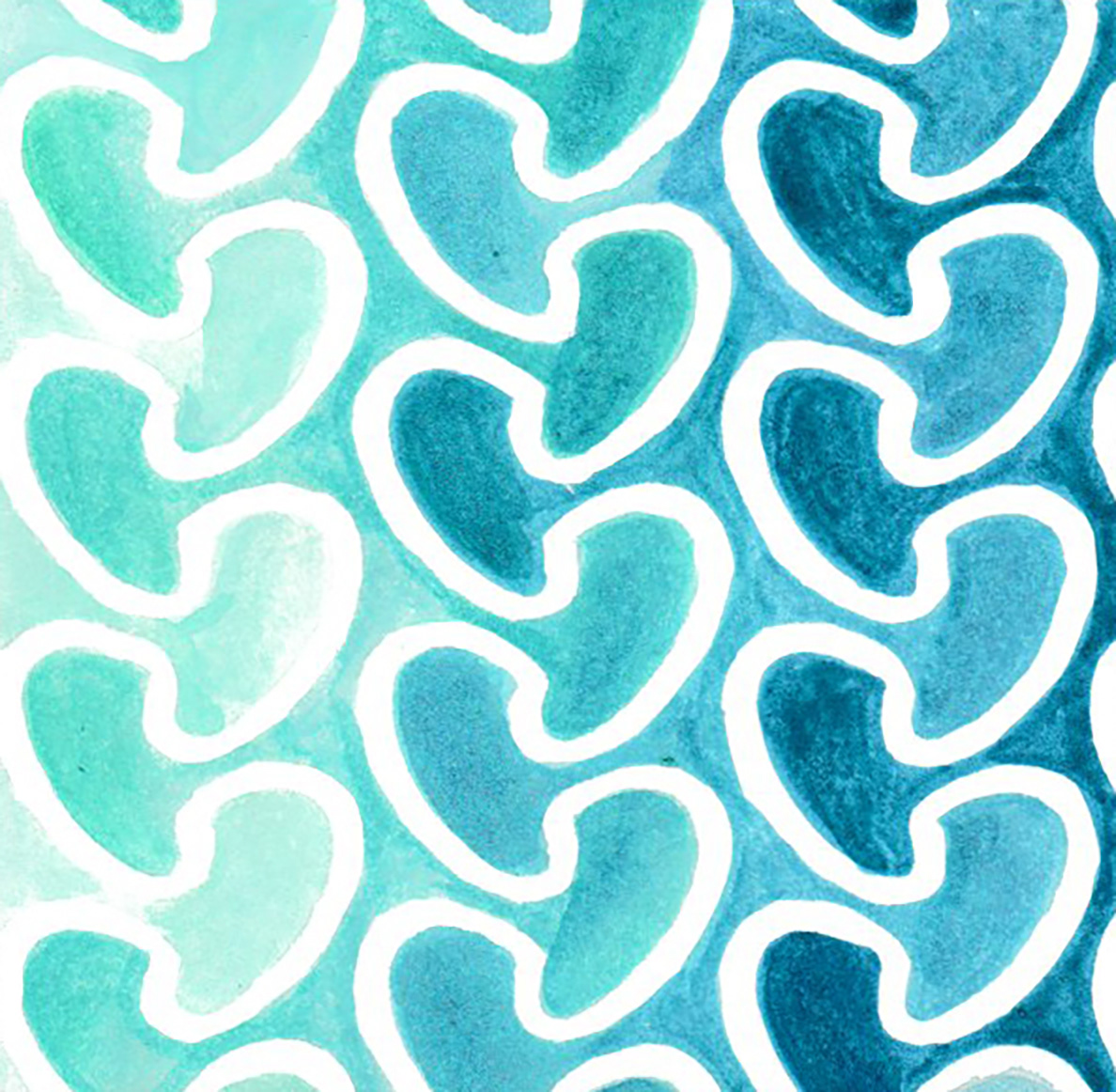
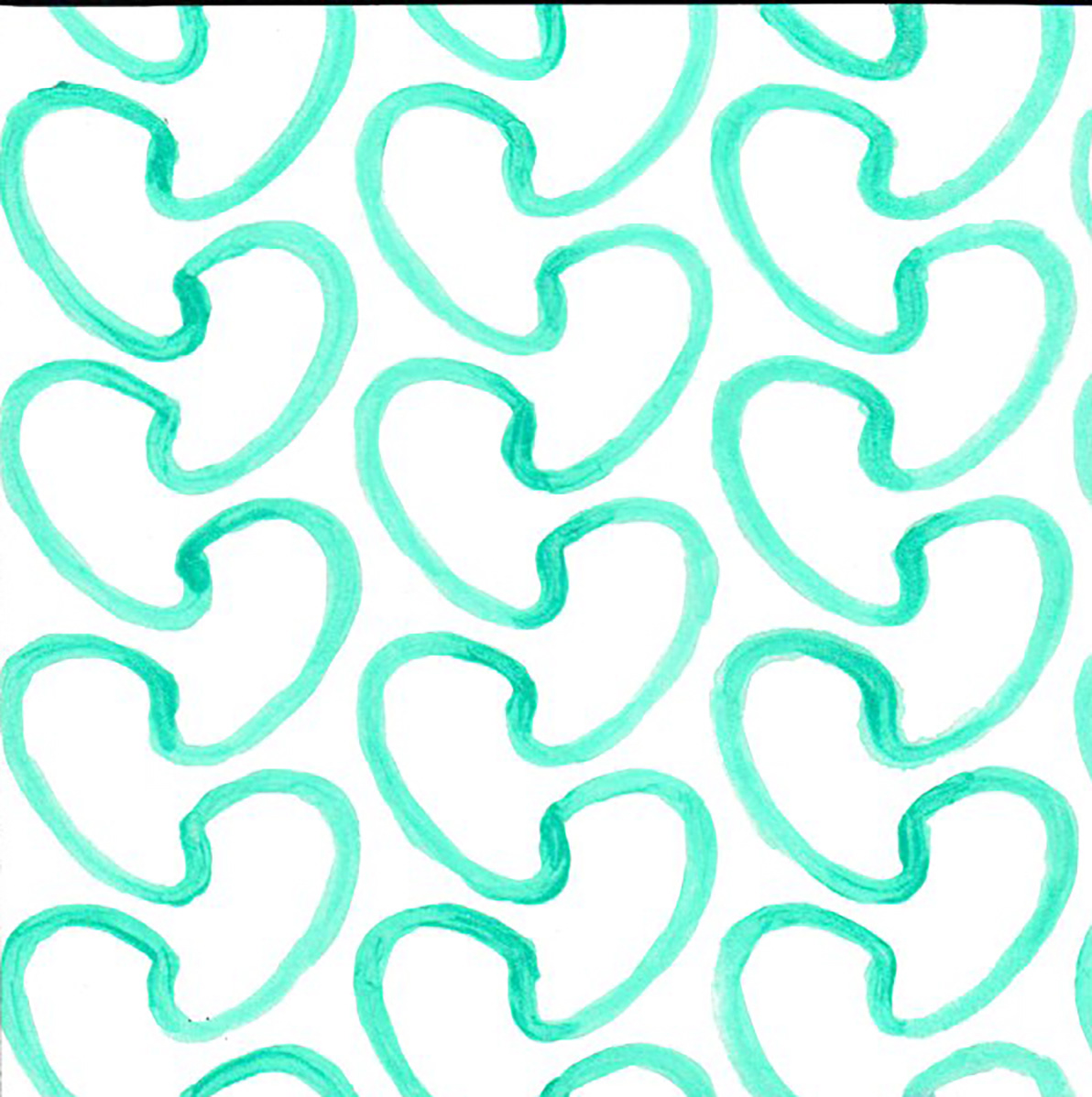
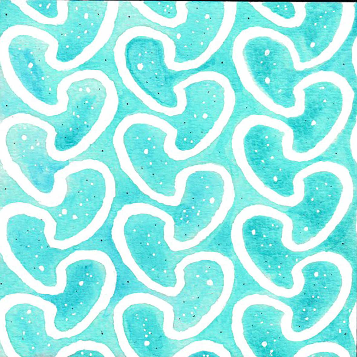
Swatch 2
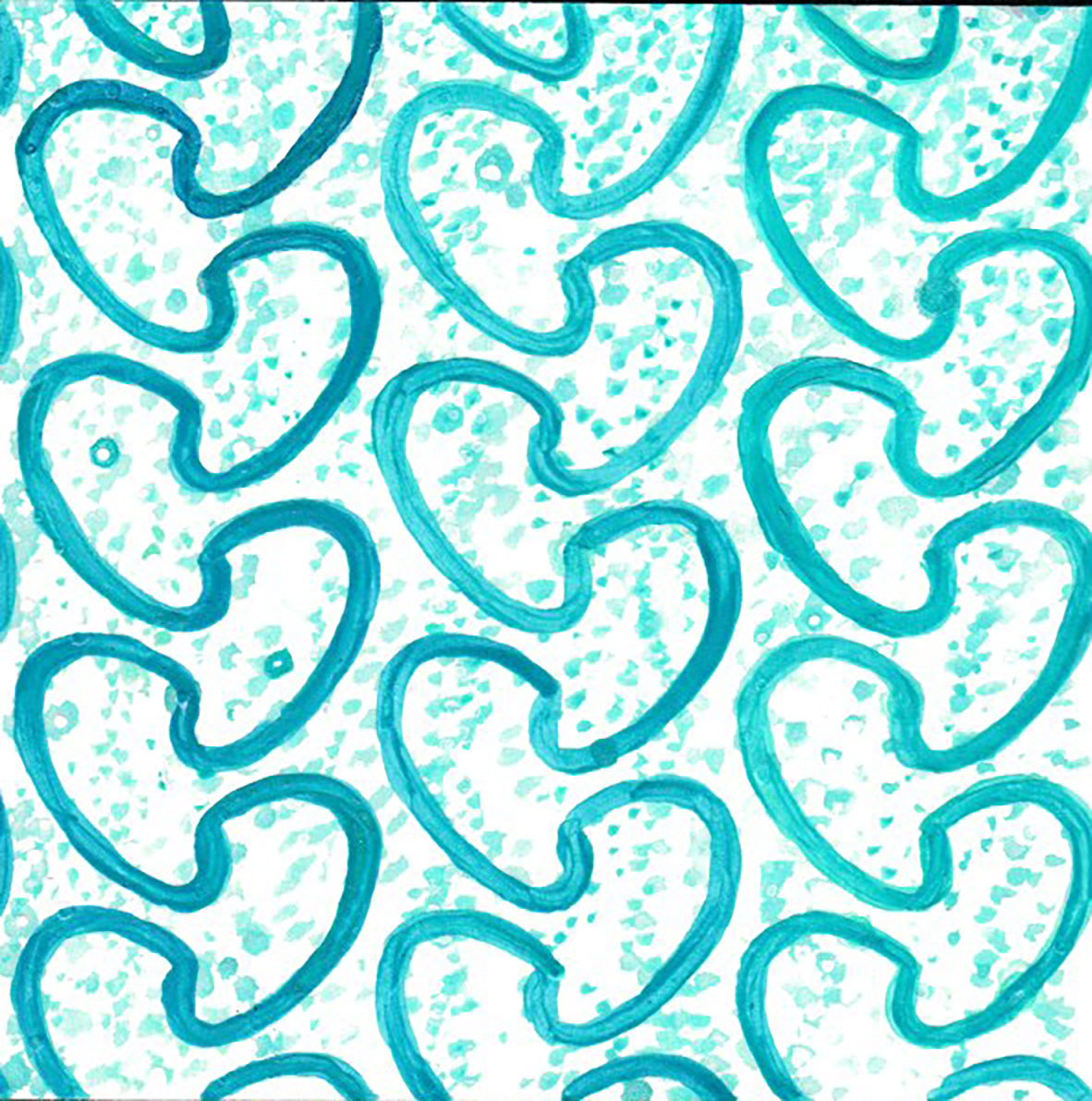
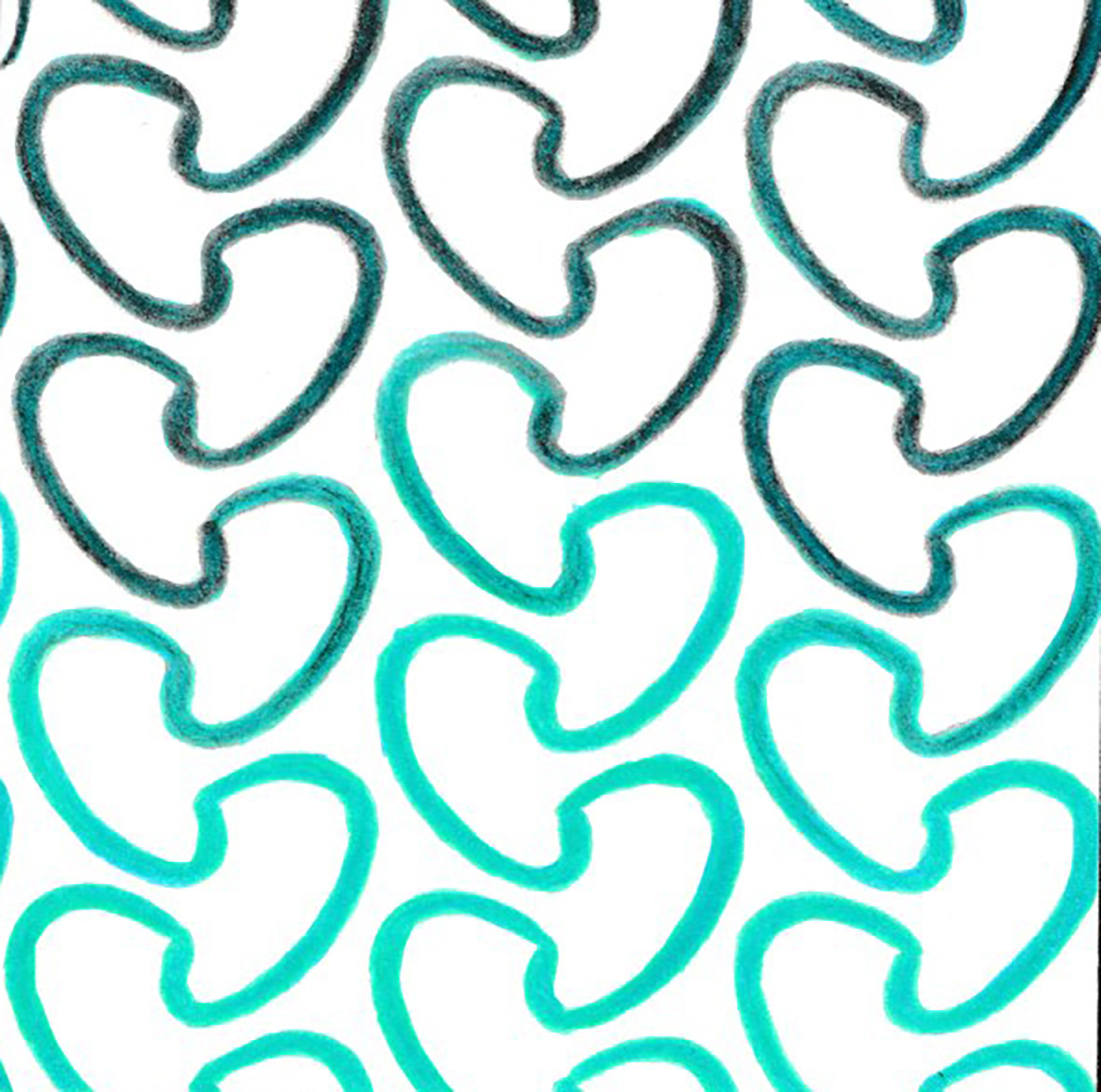
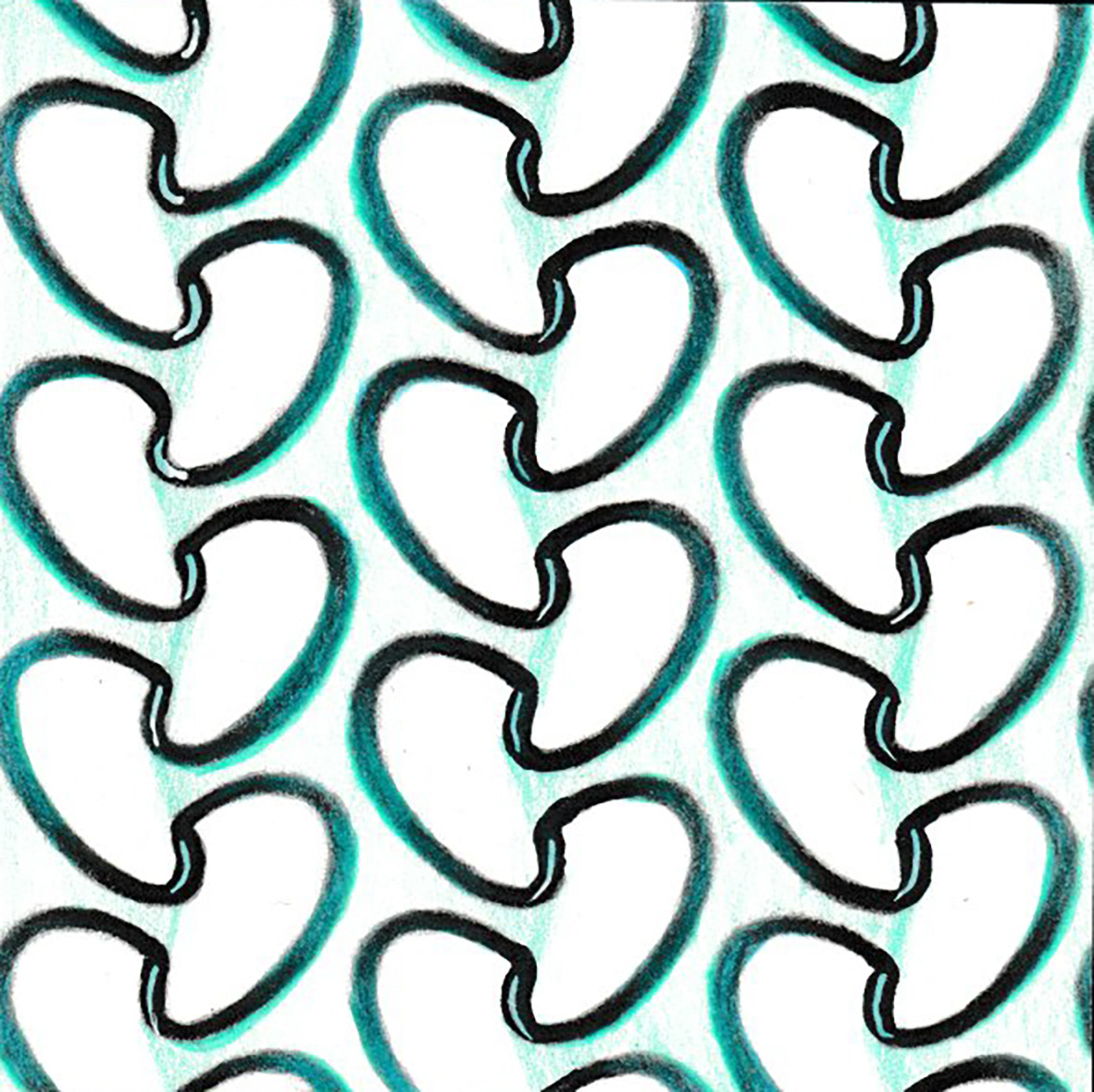
Swatch 7
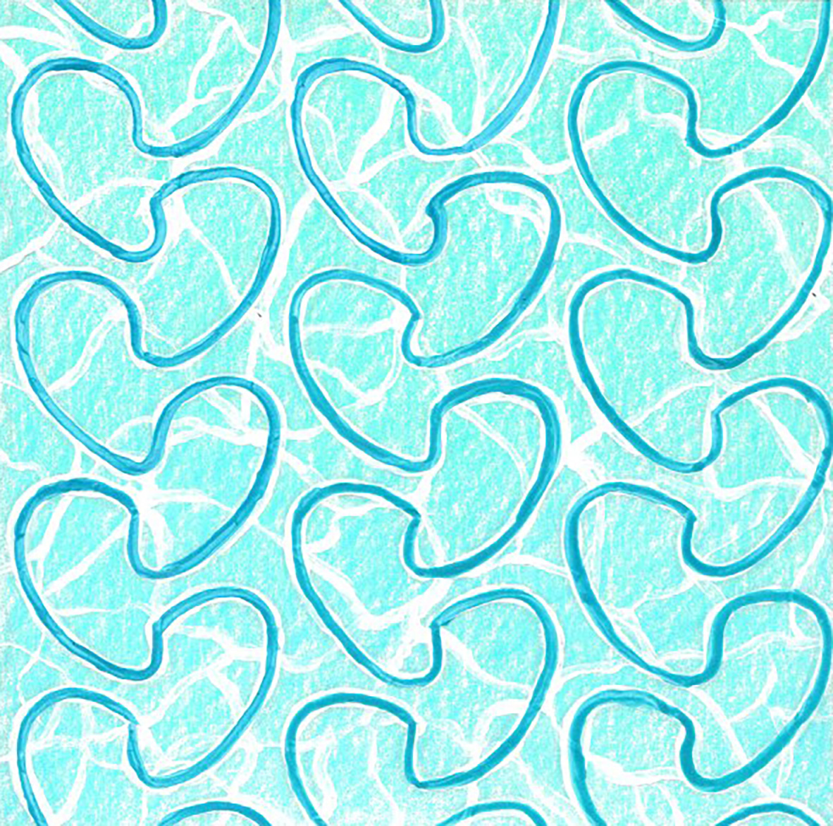
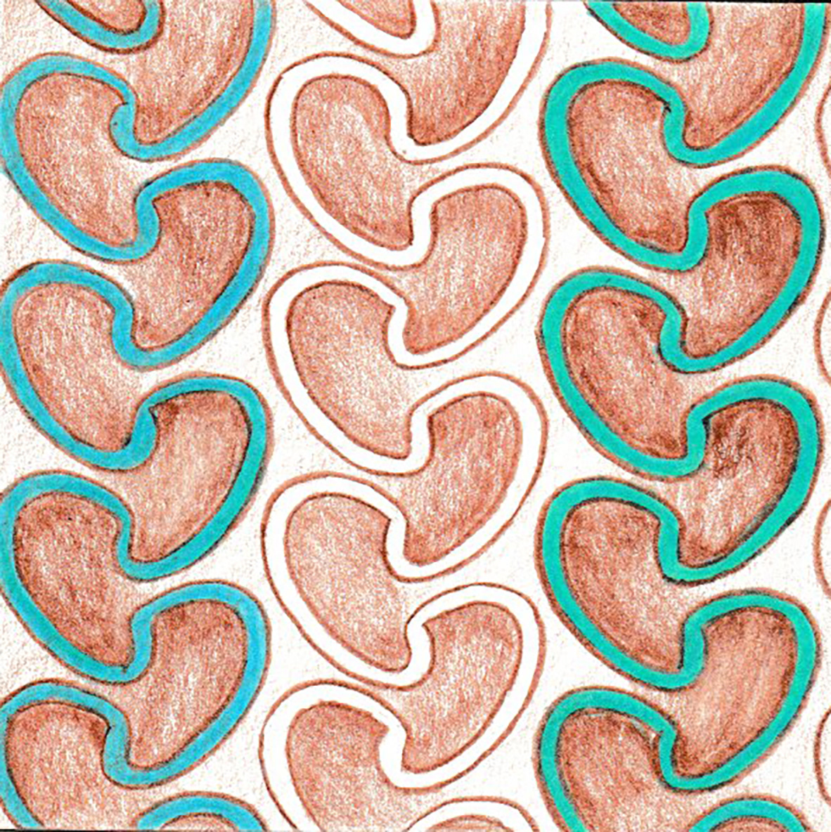
Swatch 12
The above handmade swatches represent different elements of the gift bag design and have been selected as the best among the 12 swatches, which you can view below in the process stage. Swatch 1 uses a blend of teal and turquoise to evoke the transition from shallow to deeper waters. Similar to the design of Swatch 1, Swatch 2 features a white pattern miming the foamy waves' appearance. Swatch 7, with its darker turquoise background, is dotted with rising bubbles from the depths below, created using shimmering fabric paint. Swatch 12 incorporates multiple medium materials to give the pattern the look of ripple reflections on the water's surface.
After thoroughly reviewing the entire pattern and achieving complete satisfaction, the next step was to create a swatch book to present for the pattern colour selection. The colour choices needed to align with the store's brand, the products, and the company's mission to promote ocean health. With the three best and favourite swatches selected, I combined them to create the final pattern, which was used on the retail bag.
Medium/Tools Used
Watercolors, Acrylic & Sparkling Paints
Gel Pens, Colouring Pencils & Markers
Colourful Craft Paper
Imagination
Adobe Illustrator
Adobe Photoshop
Swatch 3
Swatch 4
Swatch 5
Swatch 6
Swatch 8
Swatch 9
Swatch 10