Baby Mine is a fictional brand specializing in baby apparel, dedicated to offering affordable, high-quality, and comfortable clothing. Embracing the essence of "Tiny Unique Look," the company prioritizes sustainability, simplicity, accurate sizing, and a wide range of options for effortless matching in baby clothing.
Objective
To design an effective corporate identity package for an apparel company consisting of a logo, submark, business card, letterhead, and envelope to reflect the company’s style, target audience, brand essence and values.
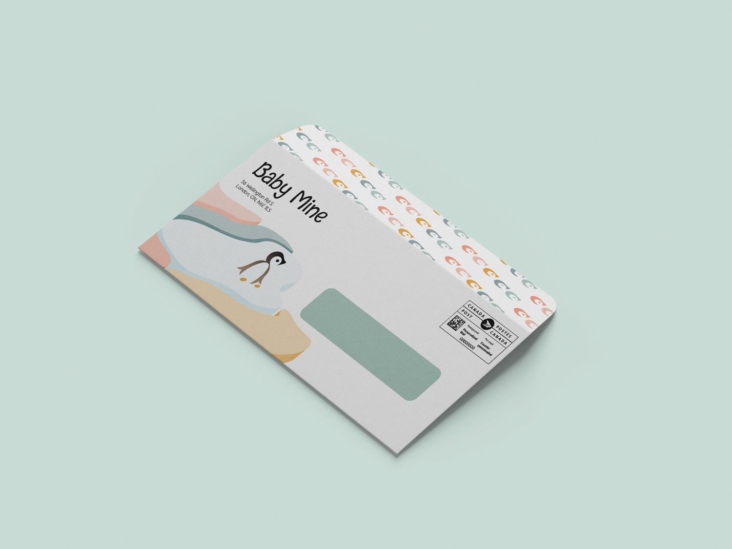
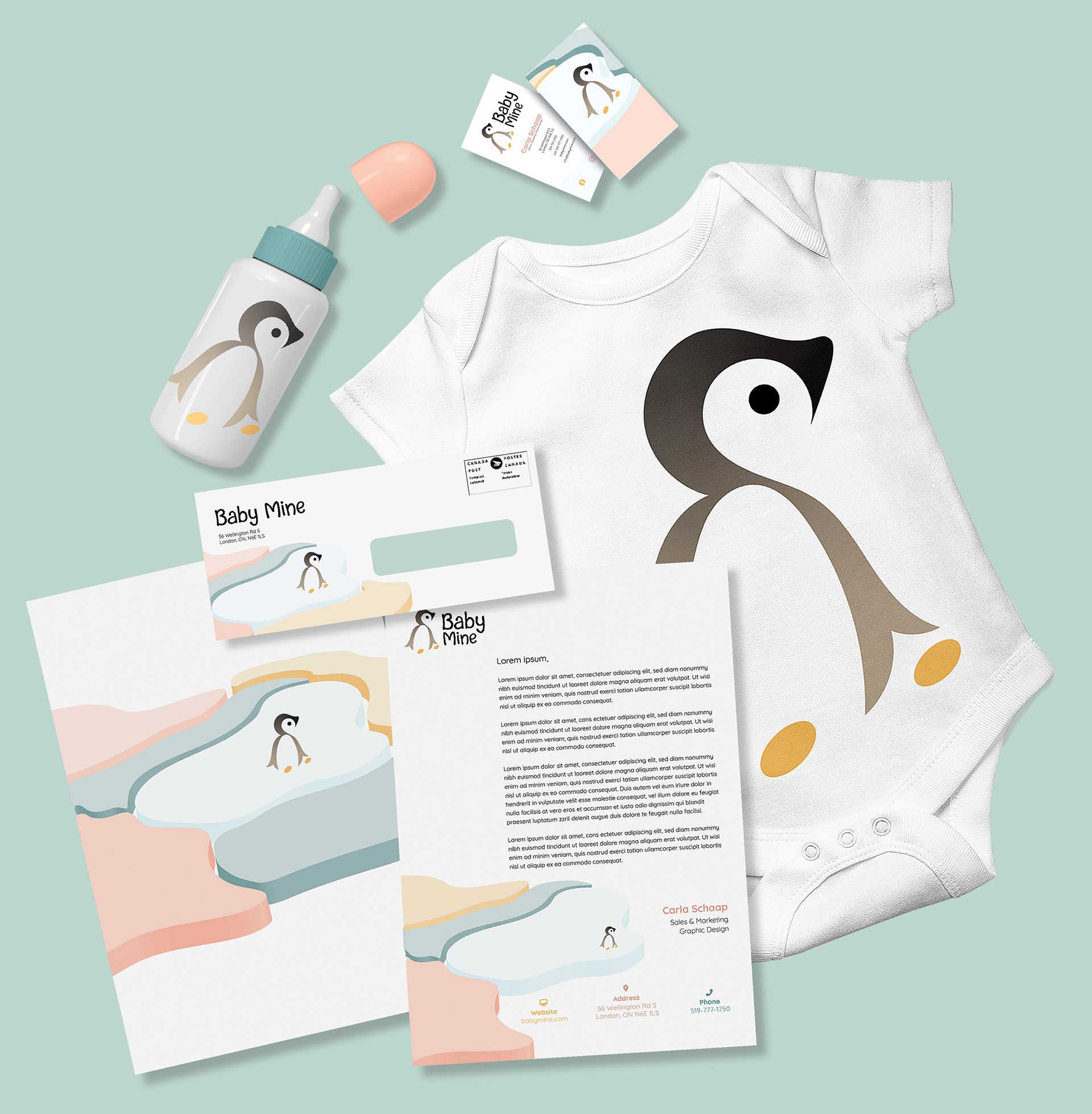
Baby Mine Envelope front view
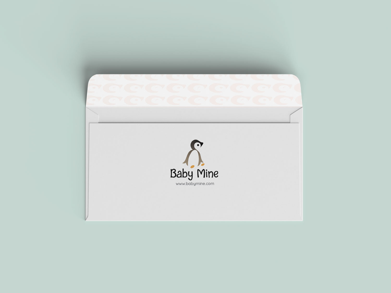
Baby Mine Envelope back view
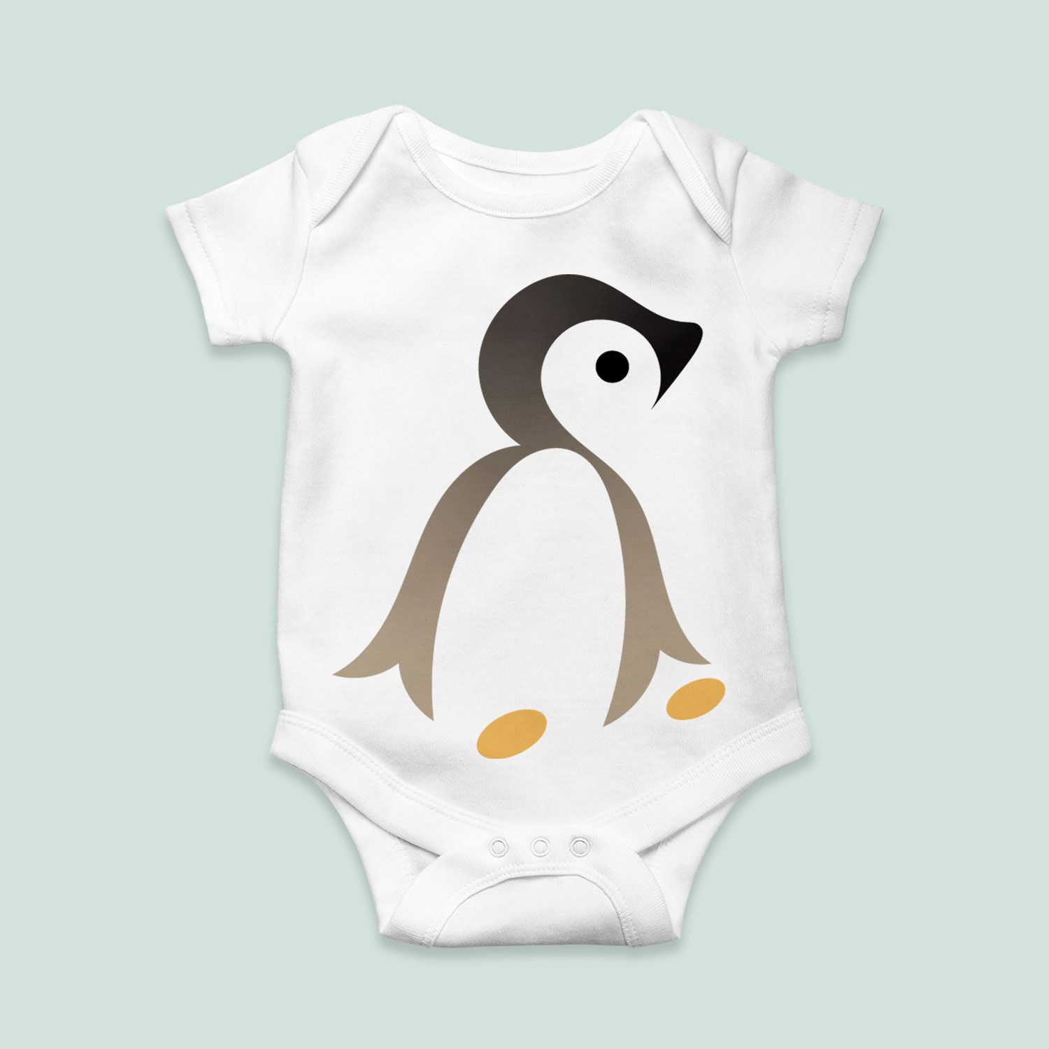
Baby Mine onesie showcasing the logo
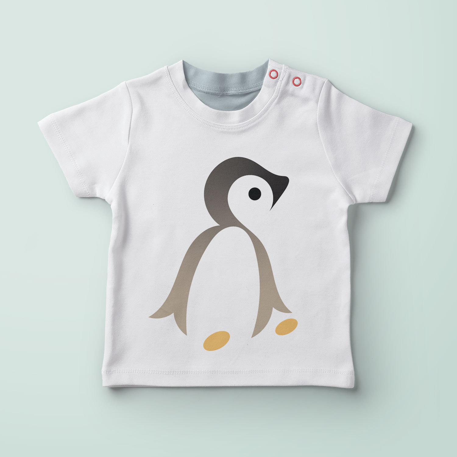
Baby Mine t-shirt showcasing the logo
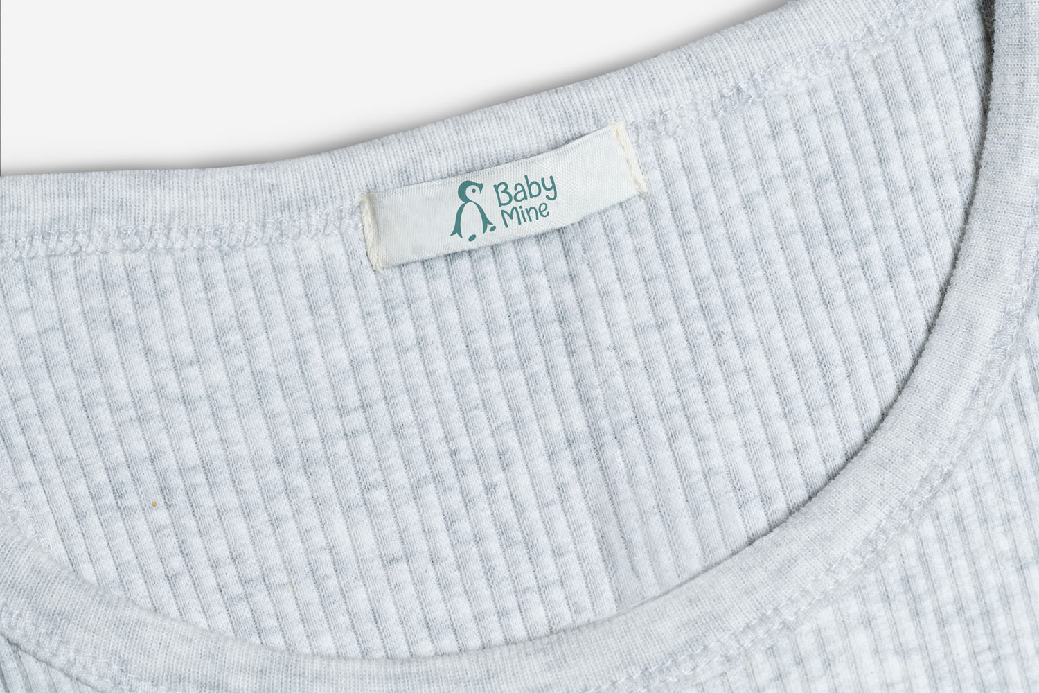
Baby Mine clothing tag
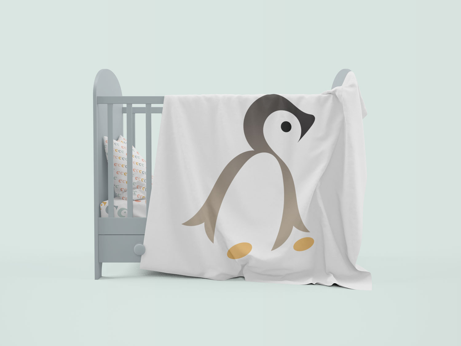
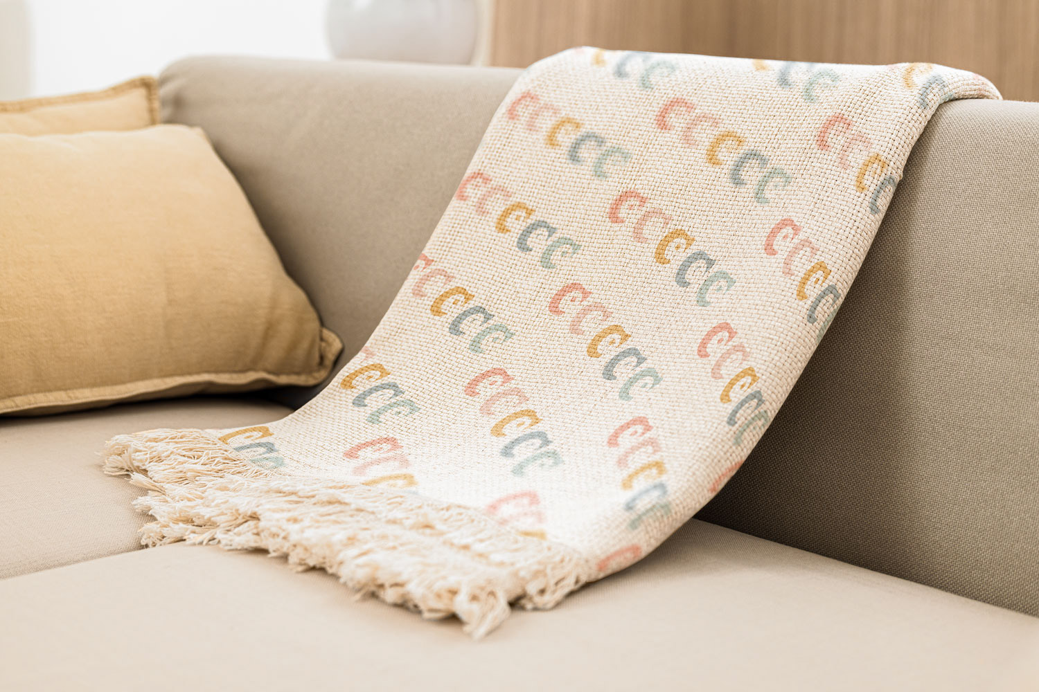
Baby Mine blanket showcasing the brand element pattern
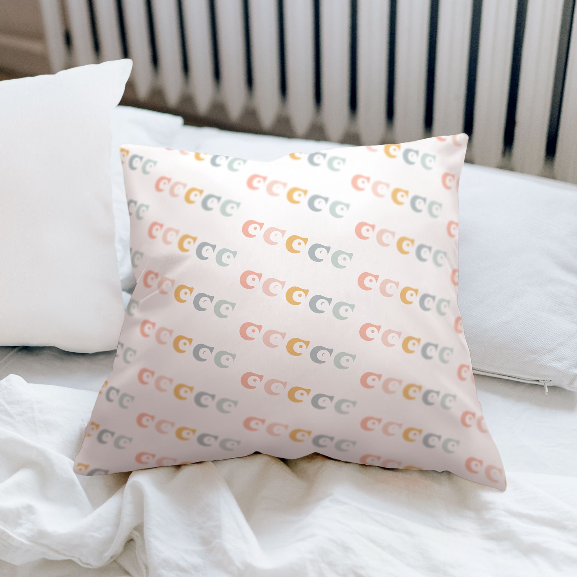
Baby Mine pillow showcasing the brand element pattern
Process
I created this fictitious baby apparel brand called Baby Mine. I chose baby apparel for this project because I was not familiar with baby clothes, aside from their cuteness, and wanted to design outside of my comfort zone. I called this brand Baby Mine because it appeals to the target audience and gives a personal touch when they say the brand name. For this baby apparel company, I wanted it to represent innocence, cuteness and curiosity.
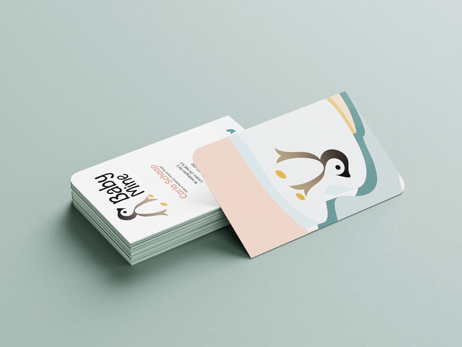
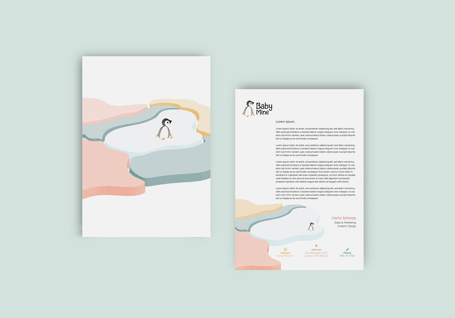
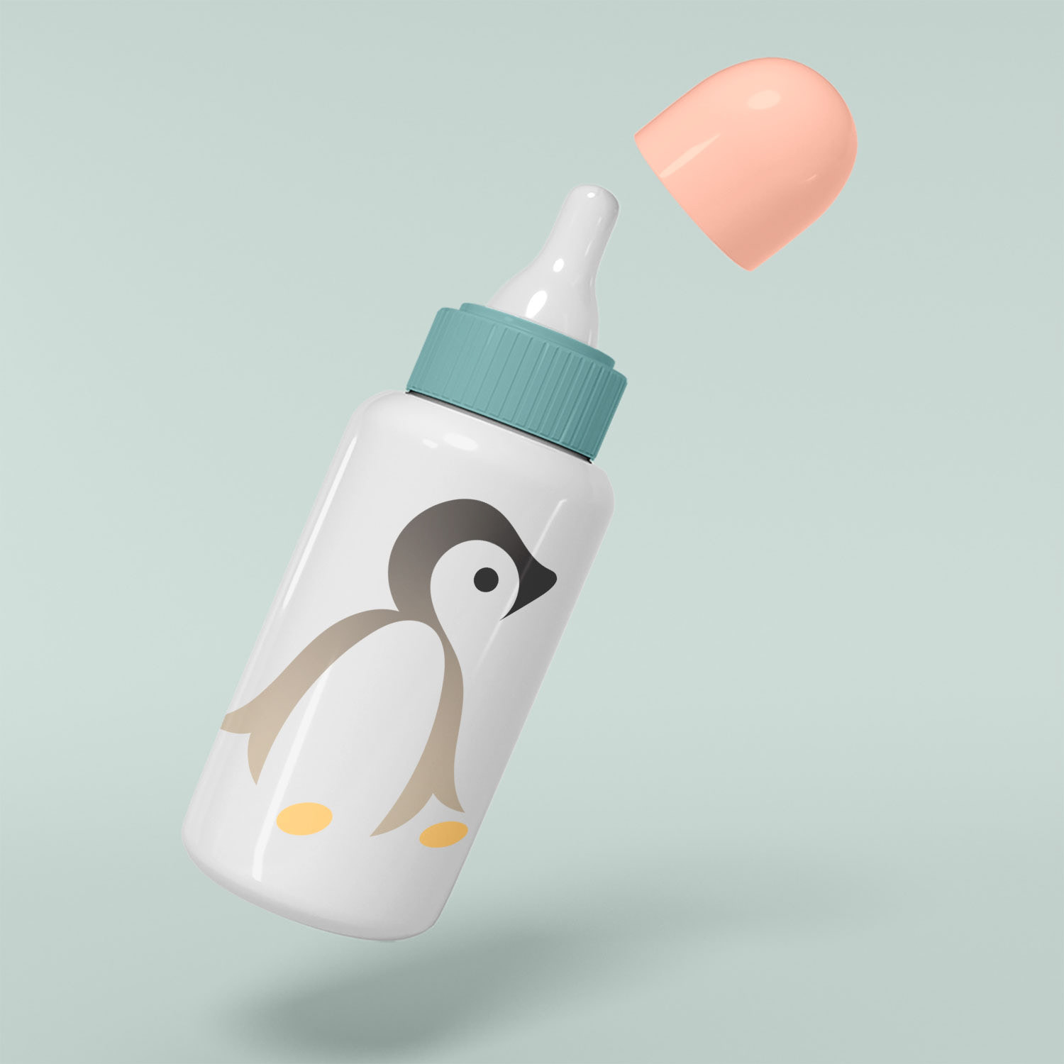
I began researching which animals possess these properties. I noticed that baby penguins look up to their parents, which expresses these properties perfectly. I sketched and used hand-drawn illustrations of a baby penguin to create the logo. The logo utilizes brown and black colours to convey a warm, soft feel. I also wanted to incorporate negative and positive space techniques into the emblem out of interest. Soft, muted, neutral colours were used to appeal to both baby genders. I created illustrated icebergs and two penguin expressions for patterns on business cards, envelopes and letterheads.
Throughout this process, I wanted to ensure that if this baby apparel company were to exist, it could be expanded into other products or services without compromising its brand identity.
Medium/Tools Used
Adobe Illustrator
Adobe InDesign
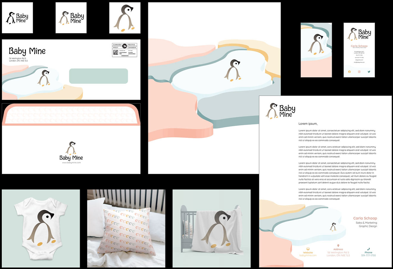
Layout of Baby Mine clothing corporate identity
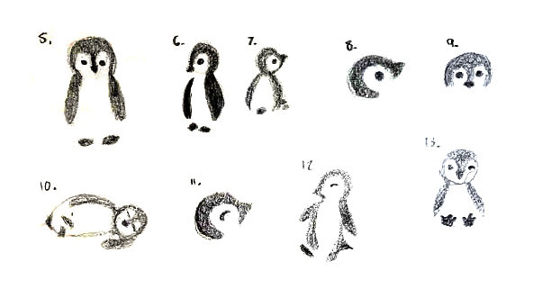
Quick sketches of the logo
Thank you for viewing!