Design 4 Change is the culminating showcase of Graphic Design students' projects, featuring work created for the Health Science (Oral Health & Wellness Clinic) at Fanshawe College. This event was entirely planned and designed by the graphic design program students.
Objective
The objective was to design a logo and branding that best represents the Design 4 Change purpose and event. Each student had the opportunity to develop a logo and identity for the event and the final design will be selected by the students, reflecting their collective choice and vision. We worked in groups to create various deliverables based on the chosen designs to ensure a cohesive event plan. I present the initial concepts for the deliverables I developed, along with my logo design.

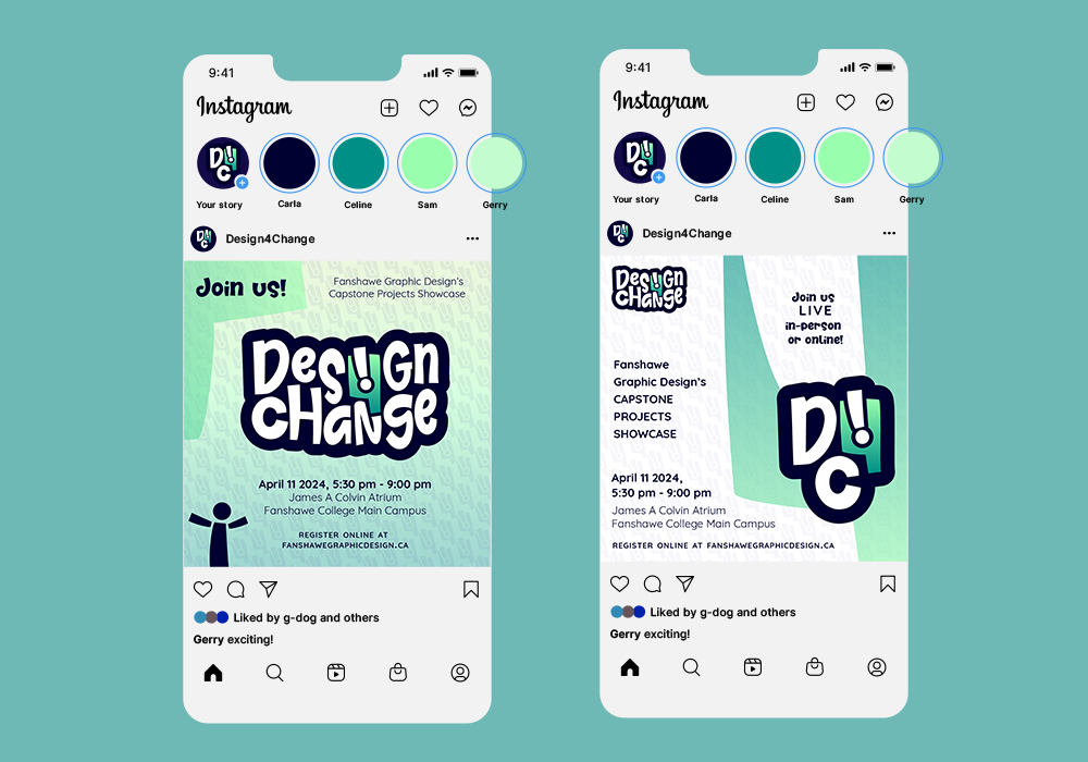
Social Media design layouts for D4C

D4C Shirt

D4C Cap

Design 4 Change banner advertisement

Design 4 Change billboard advertisement

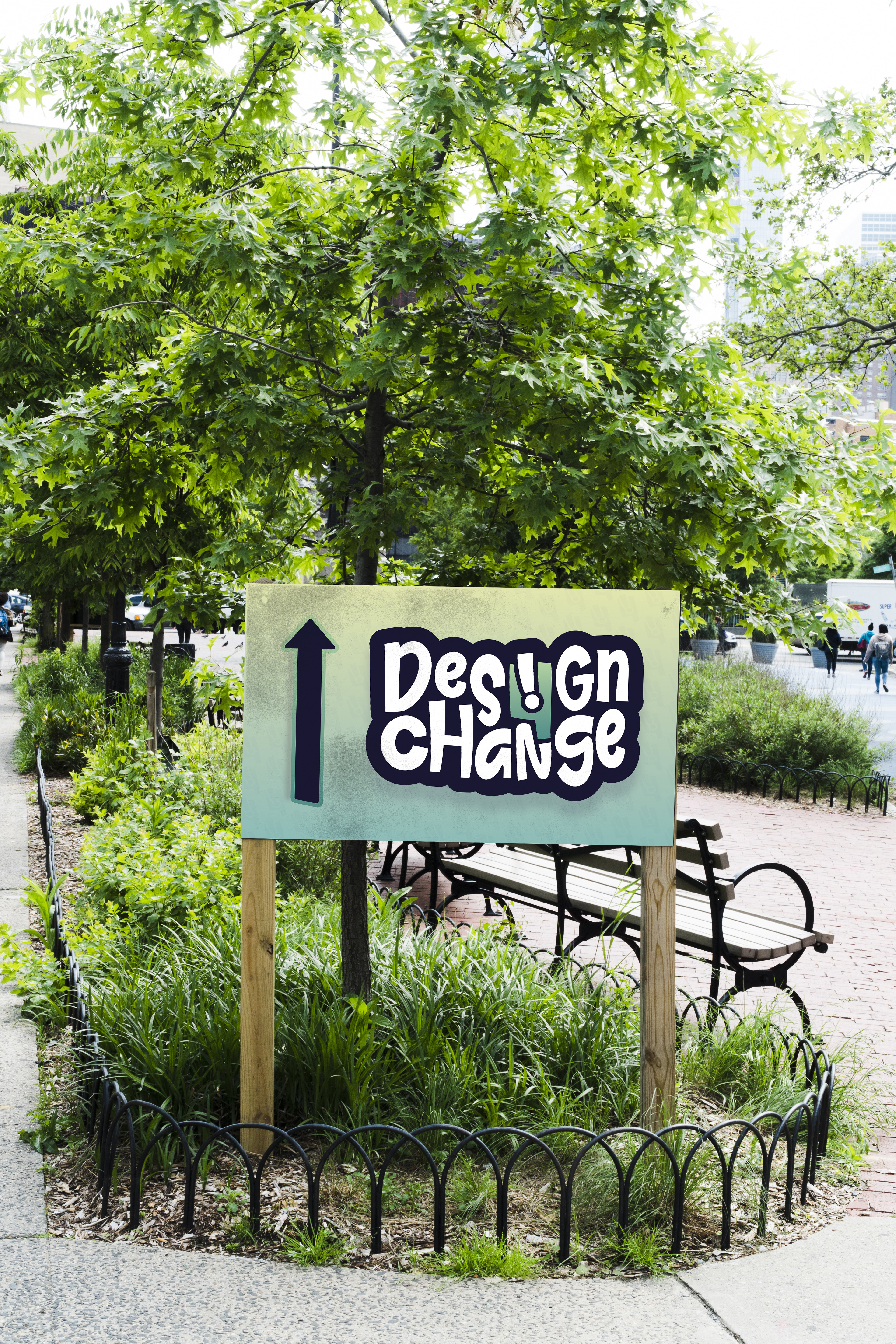
Design 4 Change event directional signage
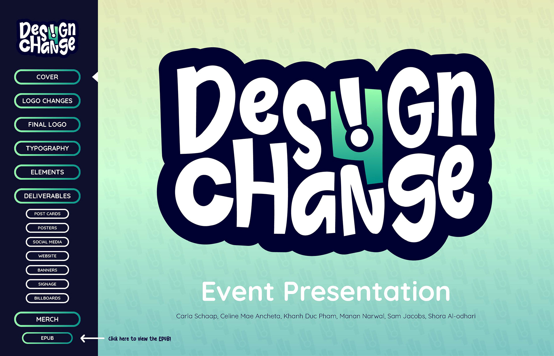
Design 4 Change Event Presentation

Design 4 Change Event Presentation
Click the button below to view the online interactive presentation and the included EPUB!
Process
During the planning phase of this project, I explored various stylistic interpretations of the number “4” intending to design a symbolic logo that embodies the success and innovative creations of graduating graphic designers. Drawing inspiration from retro and cartoon aesthetics, as well as minimalist design principles, I developed a groovy typeface and seamlessly integrated the number “4” into its design. A creative twist was added by inverting the letter “i” from the word “design” and incorporating it within the negative space of the number “4”, effectively transforming it into an exclamation mark. This design not only introduces a dynamic visual element but also symbolizes the exciting journey of graduating graphic designers. The chosen green colour represents the growth and achievements of Graphic Design Students. My logo secured a position among the top 5 voted designs in our class group. This recognition led to collaborative efforts within groups to develop various deliverables, including postcards, posters, banners, signage, billboards, social media assets, a website, and merchandise. These deliverables were combined into a presentation, along with information about branding elements, and a link to an ePub containing a short logo promotion video for the final event logo voting. While my design did not emerge as the winning logo for the event, I was genuinely content with achieving a top 5 placement. I cherished every moment and learning experience throughout the project!
During the event preparation, I contributed to creating the class presentation of our collective assets, assembling our Group Book, organizing and running team meetings, and producing the event itself. I also had the opportunity to take on a creative directing role for this project, collaborating closely with classmates. This experience challenged me to lead group discussions and helped boost my confidence as a collaborator and designer.
Medium/Tools Used
Adobe Illustrator
Adobe Photoshop
Adobe InDesign
Adobe After Effects

Logo Concepts 1

Logo Concepts 2

Logo Concepts 3
Thank you for viewing!
